


by La Macchia Group
That explains why the “Makeover” sessions at The Financial Brand Forum are crowd pleasers year after year. And it shows why many financial institutions apply to have their brand, website or branch network “made over.” Who wouldn’t want free advice from top experts in the field? But it does take some guts to put your institution under a spotlight, warts and all. And it also takes guts for the pros to present their recommendations to these institutions for the first time live on stage.
Three makeovers took place live at The Forum this year, providing valuable take-aways for both the participants and the audience. All three are summarized here with additional commentary from interviews conducted by The Financial Brand.
Makeover No. 1: Becoming A Living Brand
Auto racing provides a good analogy for financial institution brands. “Racing drivers need to look 500 feet ahead in order to set up for the next turn and ultimately to win the race,” says Ralph La Macchia, President of design, build and branding firm La Macchia Group. “It’s the same for banks and credit unions with customer expectations moving so fast,” said La Macchia, an avid amateur race-car driver.
New Jersey-based Affinity Credit Union began as Western Electric Federal Credit Union about 80 years ago and has had several name changes since. In doing research for its makeover, the La Macchia team found that what made Affinity so successful over the last couple decades is evolving. The credit union has long served an affluent, educated clientele, but the geographic market it serves has shifted younger and more diverse, according to Danielle Havlicek, Senior Creative Director, who presented the makeover along with Tim Klatt, Director of Retail Strategies, and Rachel Scott, Brand Evangelist.
The Affinity name itself still works, Havlicek states, adding that the credit union’s marketing is spot on, but “it’s not translated into their facilities whatsoever.” The La Macchia team also felt Affinity’s logo is outdated. La Macchia Group showed two concept directions for the logo as part of the presentation.
![]()
Current Affinity FCU Logo
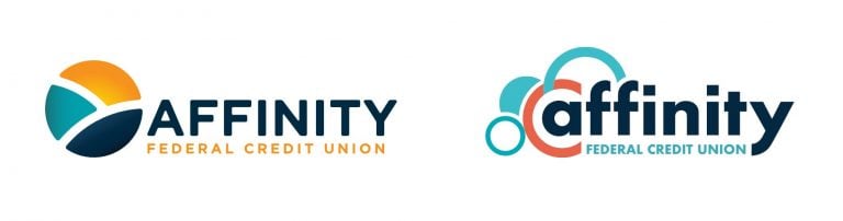 Left: Logo Concept 1 | Right: Logo Concept 2
As they grow, many financial institutions tend to become siloed. “If marketing, facilities and executive staff are not all working together, you’re going to have a disconnect, Havlicek states. “And that’s what Affinity is suffering from right now.”
“We encourage clients to constantly evolve — to become a living brand,” she continues. “That means being adaptable, open-minded, and responsive to consumer needs — understanding how things are changing.”
Part of the presentation was a candid assessment of Affinity’s branch network. “We really believe that your building is a great opportunity for brand expression. It’s your billboard,” says Havlicek. She and Klatt showed examples of how the brand could be experienced within the branch.
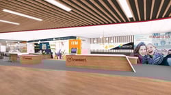
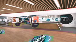
Left: Logo Concept 1 Environmental Branding | Right: Logo Concept 2 Environmental Branding
“Many of their branches are dated looking — using burgundy colors and heavy, dark wood,” says Havlicek. “That look would be intimidating to the Millennials now coming into their marketplace.” Other branches, however, have been renovated, including the installation of interactive teller machines (ITMs), tablets and even a video wall.
Havlicek says that the newer facilities are “really cool, but the one thing that’s missing is the Affinity brand. You could walk in there and think, ‘Is this a Chase branch?'”
The firm showed how a light refresh to the logo could make dramatic impact. “It’s just amazing what a little bit of cosmetic change can do to strengthen brand communication across all channels,” says Havlicek.
Affinity liked the first concept, according to Klatt and Havlicek. Both stories resonated, they said, but the second concept was a little more of a departure for the credit union.
Key Takeaways |
|
To read more about the other makeovers at the 2019 Financial Brand Forum, click here.