FOCUS: BRAND


An amplified brand identity

the recreation of a visual identity that would unite a diverse market through one major connection

Dowagiac Credit Union


Dowagiac Area Federal Credit Union was seeking a complete brand and identity refresh that would serve and promote the company’s aspirations for future growth. La Macchia Group, a national comprehensive consulting design-build firm, was commissioned to create the new lifestyle brand identity. They were tasked to research and find the right design solution, both in terms of the visual identity as well as the creative direction, to create a unique, sustainable financial brand to grow awareness and attract a diverse younger market while remaining true to their founding members.

Before photos of Dowagiac Credit Union's lobby.

Unifying a diverse market is always a challenge, so the brand was developed around a theme that unites people of all backgrounds, ages, and demographics: music. With music as the inspiration, the brand was built around the concepts of individuality and personal empowerment to inspire the consumer to achieve more.

Behind the Design

Focus group findings revealed the high importance membership placed on knowing they could rely and depend on the Credit Union for help and guidance. Members wanted to know they could trust a financial to understand and care about them, and come through for them with personal, individual-based services to meet their needs, so every aspect of the rebrand was analyzed and developed through this lens.

La Macchia Group's team worked with our credit union's board, staff and membership to develop a new brand that better reflects the identity of the Credit Union with its members, staff, volunteers and community. The new brand was then carried into the complete remodeling of the credit union office and we couldn't be more happy with the new look of our space. Our lobby is truly an experience that our members have been delighted with and we now happily call home," Cathy Merrill, CEO, explains.

Simplifying the name from Dowagiac Area Federal Credit Union to Dowagiac Credit Union was done for the following reasons:

  • Negative association by focus group of the word "Federal"
  • Shorter name easier to remember
  • Simplicity of name mimics the Credit Union’s approach to its services and offerings
  • Brings focus to the Credit Union’s local nature, which was a strength identified in member surveys

dowagiac fcu logos before after

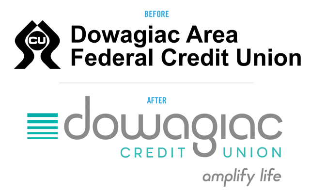
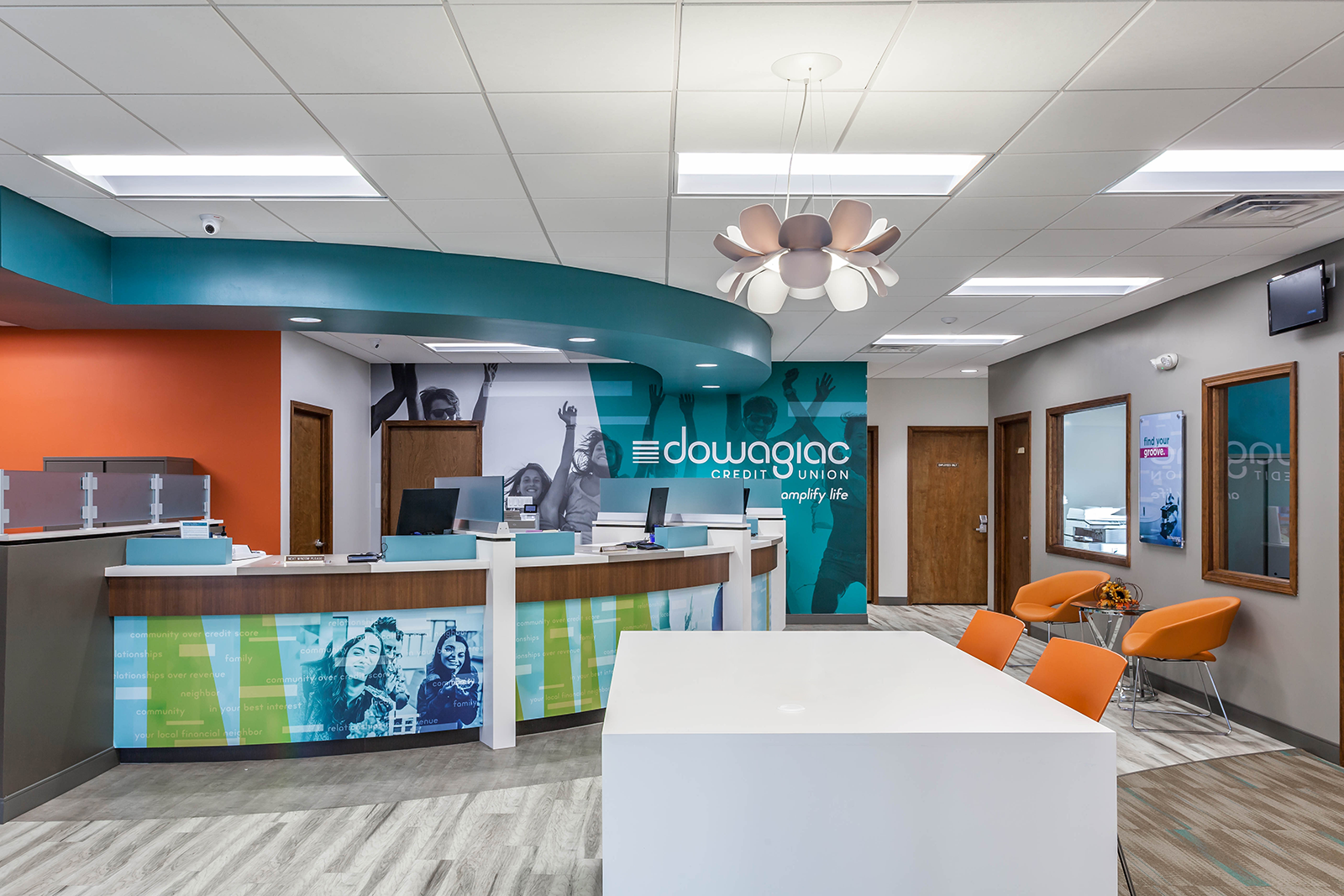
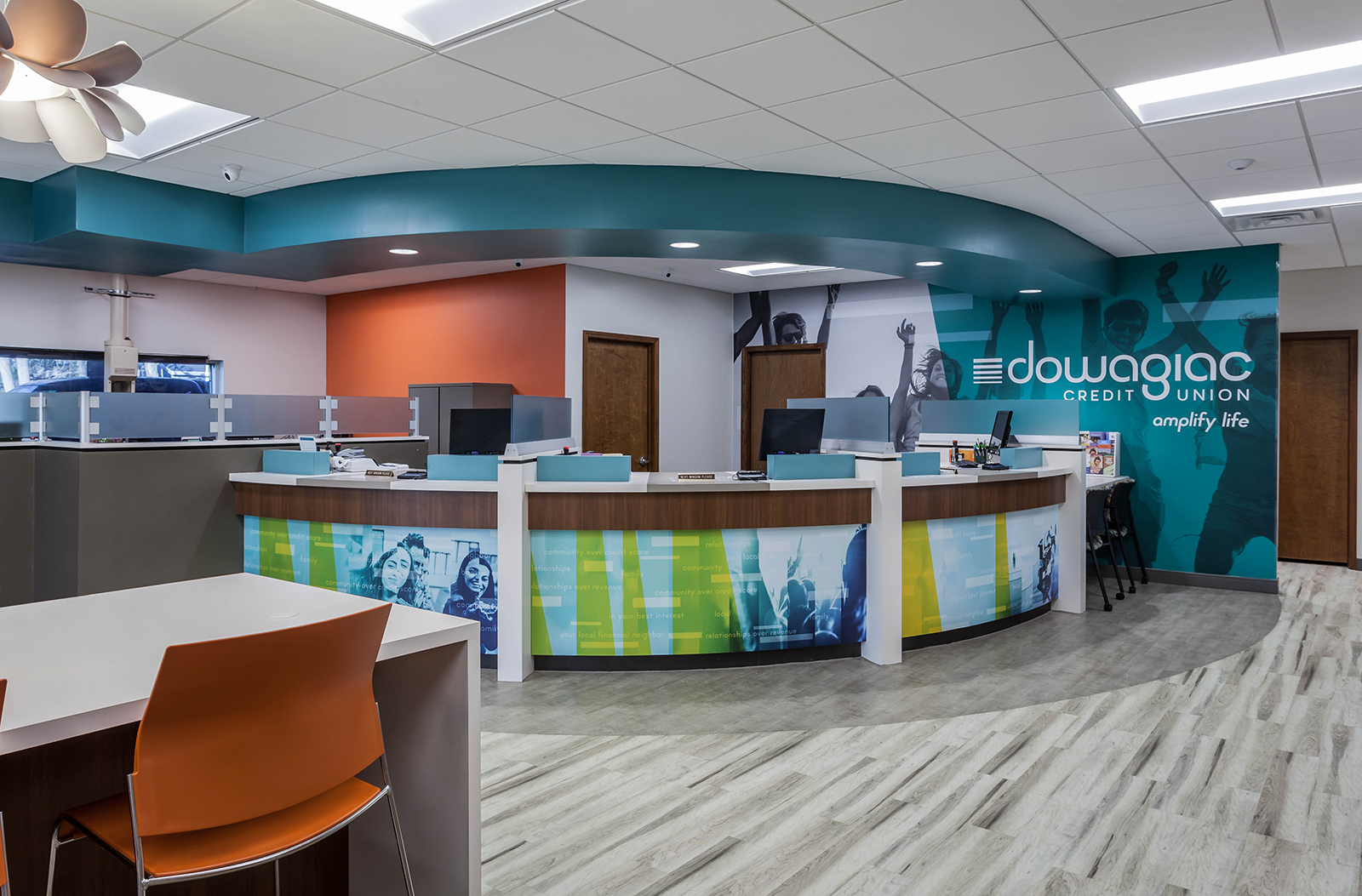
Messaging was focused around the idea of being different than other financials and amplification. At the beginning of a road trip, people turn up the music to make it more fun. Dowagiac Credit Union gives each member the opportunity to amplify their life and enjoy it.

  • Good vibes!
    • A real relationship with our members and our community that is a mutually beneficial connection!
      Amplify your life.
  • Turn it up!
    • Ready to take the leap? You can do it, and we know how to help you get there.
      Amplify your life.
  • “Is anyone listening to me?”
    • Lower rates from people you can really talk to. Now that’s music to our ears.
      Amplify your life.

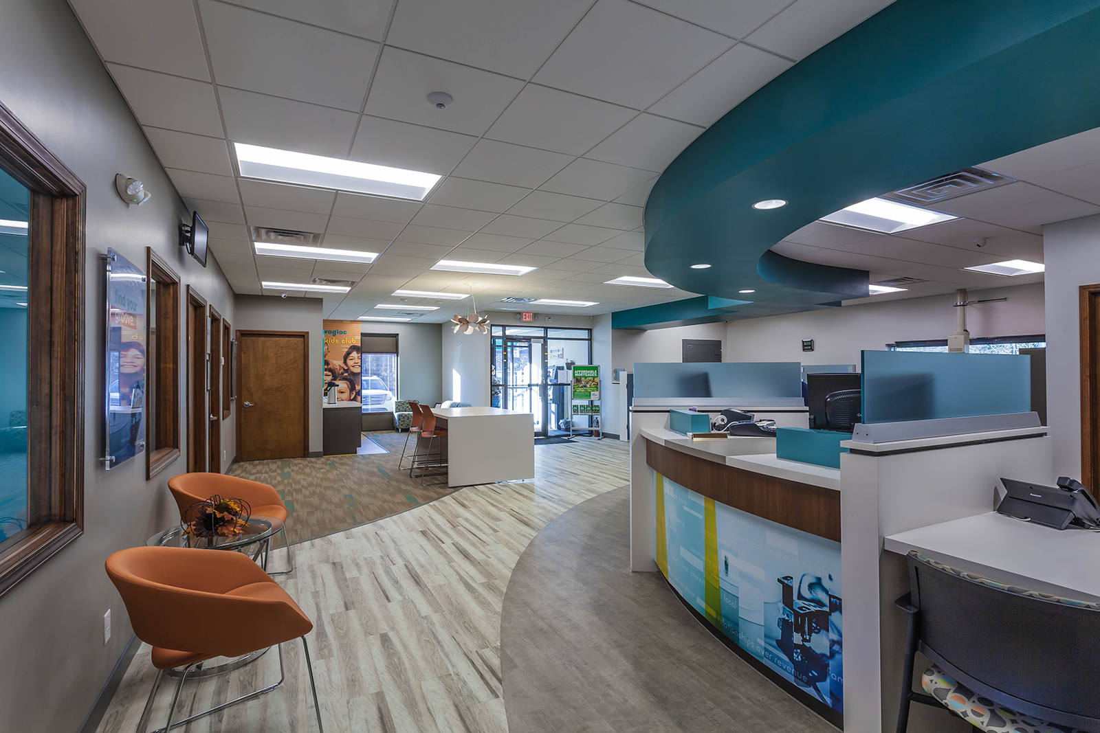
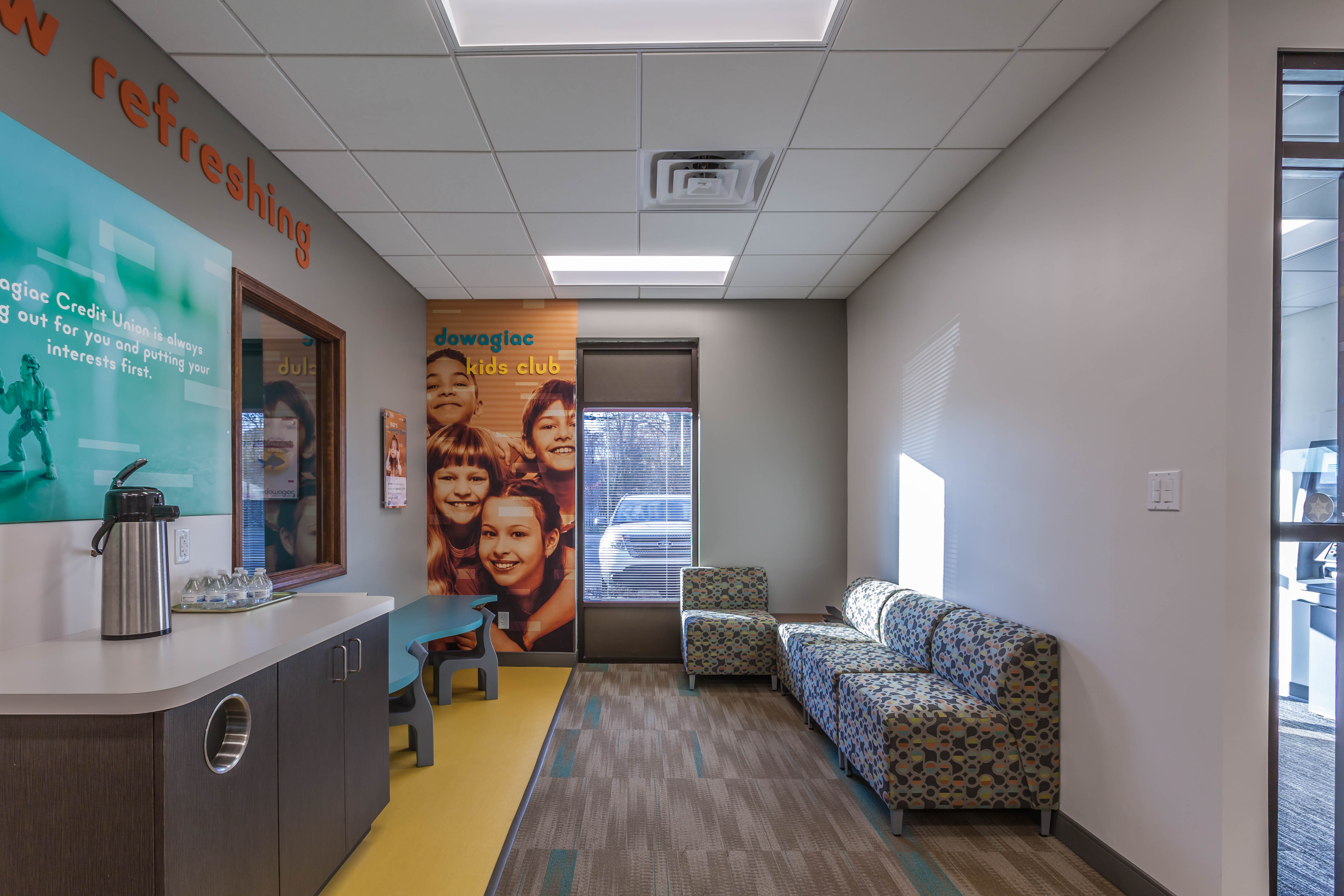
For the visual identity, photographic art direction was inspired by pop culture with bright, bold photos that reflect the fun, approachable energy of the credit union.