
.png?width=248&height=73&name=Logo%20w%20Tag%20-%20Color@300x%20(1).png "Logo w Tag - Color@300x (1)")
by Nina Penson, Senior Marketing Specialist
Many leaders in the banking industry paused during 2020 to re-evaluate plans and steer themselves back on track towards a better and brighter future. La Macchia Group rose to the occasion and helped two credit unions reinvest in their brands during a critical time and produced game changing results not only for the organizations, but for their members and the communities.
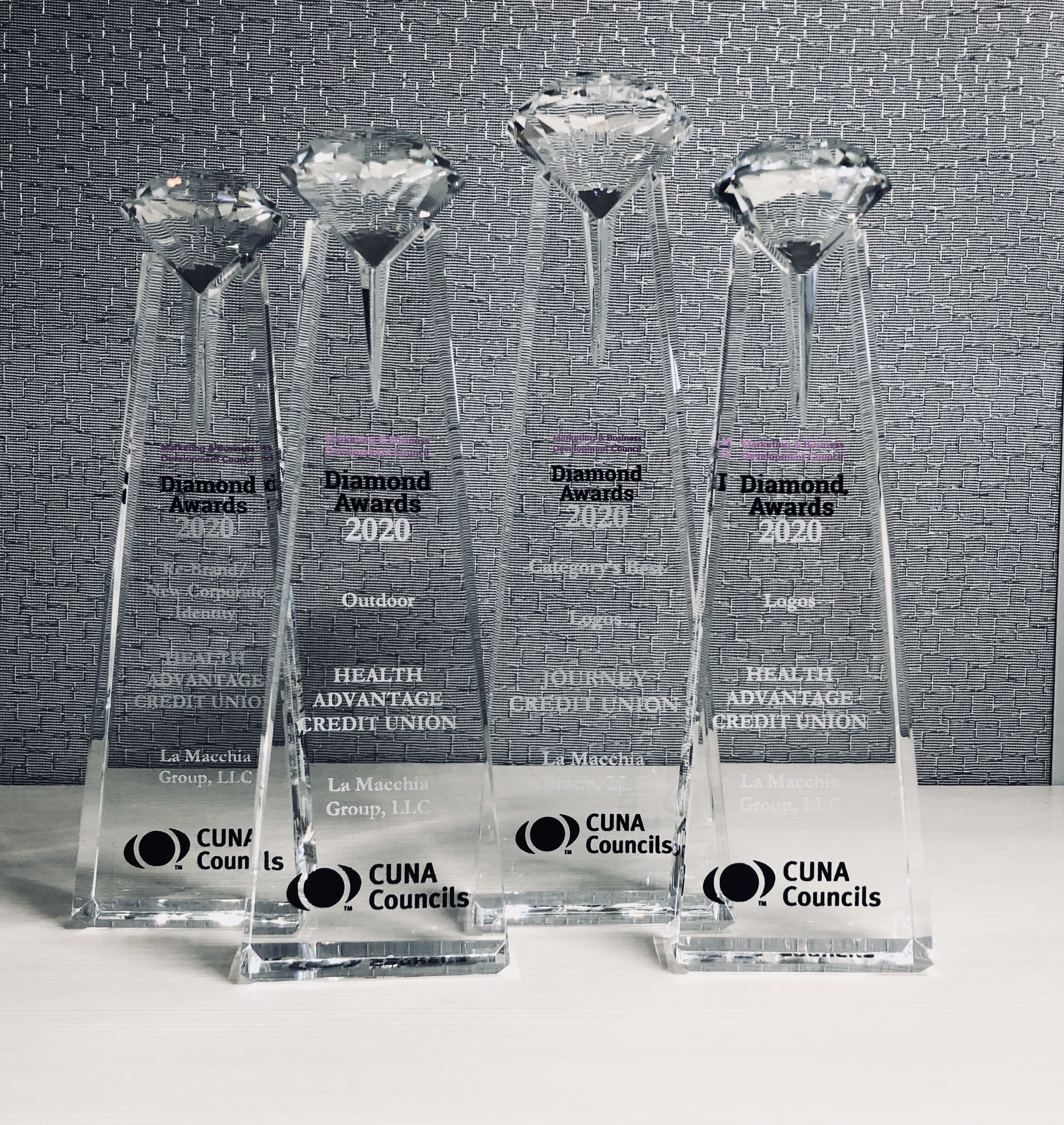
La Macchia Group's branding team, through its excellent research, design and content creation capabilities, helped two of its clients win CUNA Diamond Awards for creativity and uniqueness in a brand that excelled many others in three major categories – one of which has never been won in for the team:
Rebrand/New Corporate Identity
Video Non-Commercial (Single) – *NEW*
Logo
A common challenge with credit unions looking to rebrand their organization is how to craft the new brand so that it resonates with longtime, new and prospective members in a way that is both emotionally relevant and connects to different audiences in a meaningful way. Overcoming this challenge is absolutely vital to the success of a new brand and plays a key role in determining whether a brand will achieve buy-in with its existing stakeholders or, alternatively, if it will trip out of the gate and struggle to gain traction in the market.
Reliant Credit Union: Same Name, Rebranded Identity.
From its humble beginnings as a credit union serving teachers out of a classroom in Sodus, New York, to the nine-branch, 40,000+ member community credit union it has become, Reliant Credit Union has always been committed to serving its members.
However, studies by La Macchia Group found Reliant’s visual brand did not convey the open, caring culture of the credit union’s member – and community-oriented values, all of which highlighted the need for a shift in market perception to better connect to non-members in the marketplace.
Interviews with staff and members found that Reliant’s defining strengths were its ability to think outside the box, celebrate individuality, and understand an individual’s path to reaching his or her financial goals is not always a straight line. Reliant’s internal culture and intrinsic brand were consistent in its shared goal of working hard to help each individual member attain his or her financial aspirations – but the credit union’s existing brand didn’t convey this.
Studies also revealed the driving force leading people to seek services and financial help wasn’t just the products or services themselves, but the end result that using these products and services achieves: people were looking to achieve those milestones in their lives and attain that emotional satisfaction of a life well-lived. In this way, the core message was found – the WHY behind what Reliant does and what people are looking for. It was decided to focus on this message as both the brand promise and Reliant’s tagline: Achieve Life.
![]()
Reliant’s new brand was inspired by these findings and designed to better represent its cultural values in a visual sense, laying the foundation of the message that there is a brighter outlook, and your life path doesn’t have to be what it’s been. While the dark blue is a homage to Reliant’s history, the updated orange, gray, and turquoise colors were developed to be a focal point on the members and their future, with the chevron arrow as a nod to always moving forward and achieving more in life.
Their brand promise and tagline – Achieve Life – acts as a call to action to the audience, encouraging them to look beyond the probable to explore what is possible with Reliant as their financial partner.
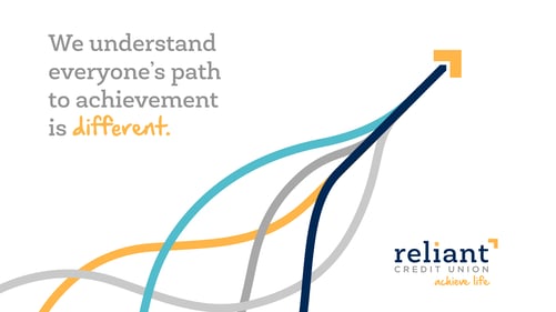

From bold, eye-catching graphics to support the ideas of life, achievements, and moving forward, to the supporting imagery of moments of personal achievement, every element of the new brand was developed to support and enforce the Reliant message throughout the applied branding in a fresh, modern, and approachable way.
Unprecedented Events.
It was absolutely crucial that the brand message was one that struck an emotional chord within its audience in order to be memorable and stand out from the rest. With oftentimes very little time to make an impact with an audience in such a busy world, strategic messaging and visual graphics needed to be simple and bold yet resonate on a human level.
Another unprecedented market factor that contributed to the strategic execution and timing of the rebrand was COVID-19. While many brands shifted their focus elsewhere during this time, our findings revealed that now more than ever, people are seeking real member stories that highlight personal achievement and overcoming obstacles despite negative life situations.
Focusing the messaging on these stories, pulled from member research, ignite hope and encouragement within Reliant’s community that they can indeed recover, pick up the pieces, and achieve their best lives despite the immense financial setbacks, hopelessness, and discouragement that many were experiencing during 2020.
A Celebration Of You.
With a focus on changing the perception of what a financial can do for its members, Reliant Credit Union’s video message sought to breathe new hope into its audiences that there is a financial out there that believes in them and wants to help them succeed in their lives – celebrating their individuality, their victories, and standing by their side as they forge their own paths in life.
Footage in the video took on a home-grown feel, using relatable clips of genuine moments of joy or achievements in peoples’ lives that pulls on the heartstrings; the language of the script turns what many in the community felt unwanted for – not following the traditional path in life – and instead makes it something worth celebrated and exploring.
Watch the Reliant brand video here:
CoastLife Credit Union: A New Logo Design.
Coastal Community and Teachers Credit Union in Corpus Christi, Texas recently renamed itself to CoastLife Credit Union to better branch out into the surrounding communities and communicate its full, circle-of-life approach to its product and service offerings and “coasting through life” ease of doing business with the credit union. Thus, came the challenge: how to create a visual representation of this idea through a new logo design?
Conveying the feeling of familiarity, happiness, and ease that research revealed is oftentimes invoked by happy memories on the beach and under the sun was a critical element in CoastLife's logo development. This knowledge, along with the geographical coast symbolizing vacation and ease, inspired the sunburst logomark around the ‘C’. Communicating trust and longevity was also important and is illustrated through the rich purple and flecks of gold throughout, rather than the lighter, beachier tones that one might expect from a credit union in the area.
To complete this logo, handwritten text that makes up the credit union's tagline further accentuated the familial friendliness of its culture, conveying the unpretentious and fun nature of CoastLife.
![]()

LG: Focused On The Future.
Five straight successful years of awards continues to motivate the La Macchia Group branding team to win another year, making it six in a row. As the team regularly monitors and analyzes consumer behavior in the financial services industry, Rachel Scott, Brand Manager, shares her valuable insights: