
.png?width=248&height=73&name=Logo%20w%20Tag%20-%20Color@300x%20(1).png "Logo w Tag - Color@300x (1)")
by Nina Penson, Senior Marketing Specialist
La Macchia Group's branding team shares what the 2020 CUNA Diamond Awards mean to them as well as their brilliant insights on these award-winning re-brands.
The world we live in today is flooded with competitive brands all fighting for one thing – your attention. What makes you do business with a brand? What matters the most to you? More importantly, what are your values and what's your plan? These are all questions that La Macchia Group’s branding team think about when going to bat for a client’s brand.
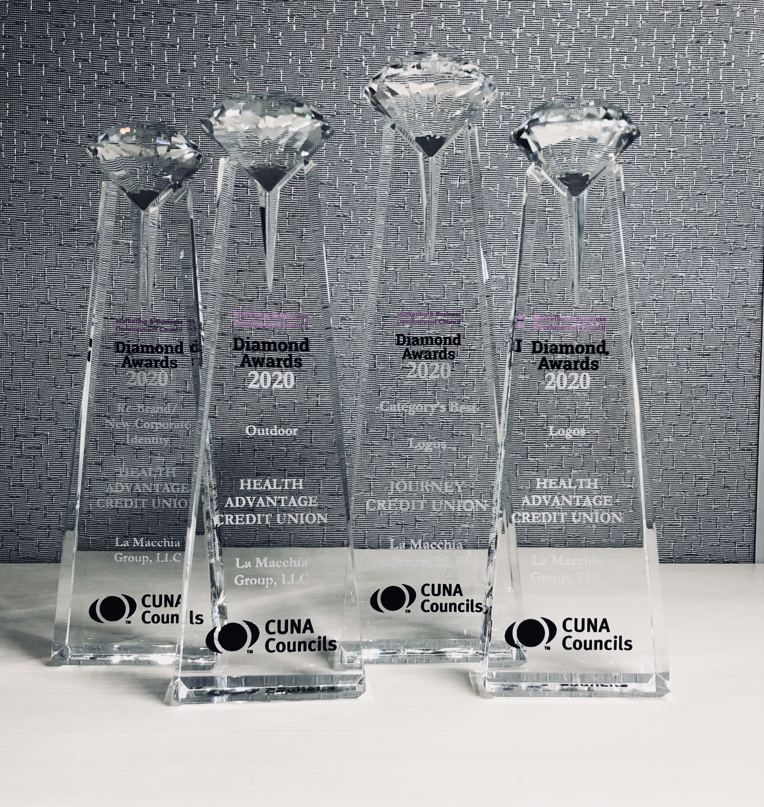
Rachel Scott and Steve Labecki, La Macchia Group’s branding veterans, recently helped our clients win four 2020 CUNA Diamond Awards for excellence in three major categories – Logo, Outdoor, and Re-brand/New Corporate Identity. Here are their stories:
A Credit Union That Understands You.
Health Advantage Credit Union went through a major brand transformation, the results of which won awards for Re-brand/New Corporate Identity, Logo, and Outdoor. Originally chartered as Saginaw Medical Federal Credit Union, the company was struggling to grow and connect with potential members in the healthcare field. Facing a brand identity crisis, they turned to La Macchia Group to address:
- Brand misconceptions
- Elevation from the competition
- Becoming the number one choice by those in the healthcare field.
Ultimately these challenges shaped how La Macchia Group's branding experts analyzed the brand. Research revealed that their current name, Saginaw Medical Federal Credit Union (SMFCU) and overall brand struggled to connect with their target market in a meaningful way. Many potential members connected to the healthcare field were unaware they were eligible to join as it was perceived only doctors and possibly nurses could bank there. A new name was at the top of the list for this transformation, one that would reach across the healthcare industry. La Macchia Group's branding team worked with the credit union to identify a new name that had a double meaning, proclaiming both a financial, as well as a healthcare advantage to those who do business with the brand.
The branding team then developed a tagline to take the message behind the new name even further. One of the goals of the re-brand was to position the credit union as the number one choice for those within the healthcare field. Thus, the new tagline "Take advantage of life" was chosen to connect to their target market's desire to live fulfilling lives both inside and outside their professional lives.
Elevating the brand and distinguishing them from the competition was going to be key. The credit union knew they wanted to become the number one choice by those in the healthcare field, but what was missing in order to get there? It's not widely known that medical professionals have unique financial challenges that need to be addressed. Post-graduate training and residencies are extremely time consuming and leave little room for financial literacy. With high debt but lots of earning potential, opening up a private practice or getting the best rate to refinance student debt can feel like a burden without the right help. Health Advantage CU deeply understands these challenges which is why they're motivated to becoming the number one choice for healthcare professionals.
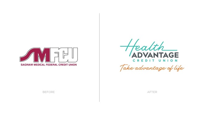
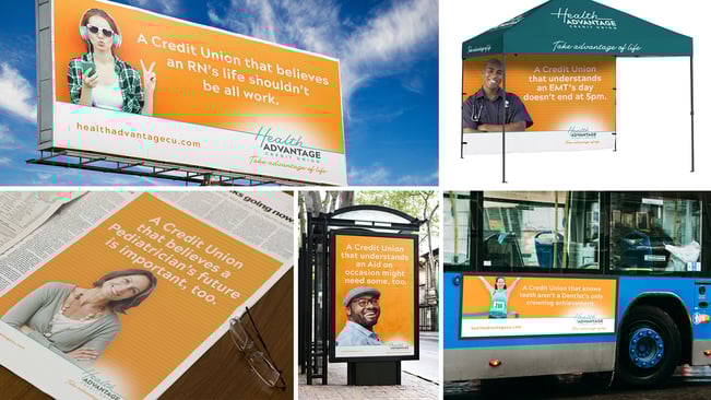
Even with a new name, the challenges they faced warranted a more comprehensive visual overhaul of the entire brand. Just like the handwriting on a doctor's note, this script-style font ensures a personable, unique and human element is always present. It's also meant to be an abstract representation of an individual heartbeat that captures those milestone moments in life. A mood and color audit of the marketplace revealed an opportunity to differentiate the brand with colors underutilized in the branded landscape. The tagline indicates a powerful call to action meant to trigger one into taking advantage of what's possible in life with the credit union by their side. Check out Health Advantage's transformation for a more detailed look.
This new brand gives Health Advantage CU the leverage needed to be a premier healthcare industry financial institution.
A Logo Identity Crisis.
A logo is a recognizable symbol of a brand and often captures the consumer’s eye first. Sure, there are other pieces to the puzzle such as the name, color palette or even the tag line, but having a strong and meaningful concept to help develop that logo will ensure everything else can fall into place.
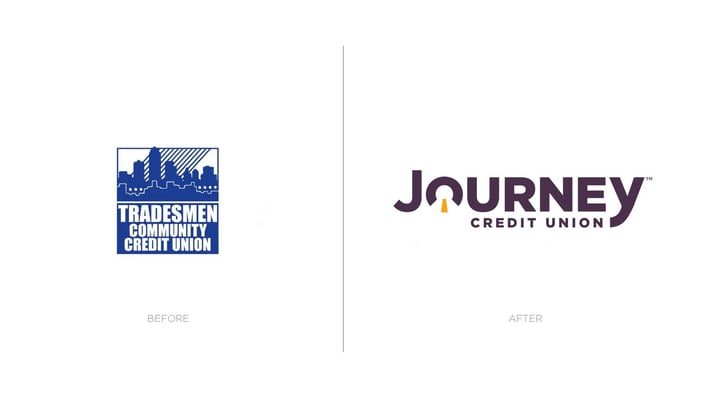
Journey Credit Union, formerly known as Tradesmen Community Credit Union, was going through an identity crisis. They were finding it hard to grow as members in their community thought they couldn't join the credit union if they didn't work in the trades. The credit union had outgrown their name. How does a credit union update its name and brand to better connect with new markets without alienating its current and long-term ones?
The La Macchia Group branding team sought out a concept that would speak well to current members and equally welcome new target markets. It started with a few simple ideas "life is a journey and we're here with you every step of the way" and the recognition that journeyman is a specialized position in the trades. From there, the concept of Journey Credit Union was born. The name aligned to the mission and purpose of the organization: Journey CU wants to make sure they’re with you every step of the way on your path to financial success. For its current and long-standing members in the trades, it was a nod to the credit union's heritage and the tradesmen who had been with the credit union from the beginning. Making their target markets feel empowered was essential to supporting the vision and was the inspiration for a category’s best logo.