How To Get The Most Out Of Your Rebrand
by La Macchia GroupIDENTIFYING WHAT MEMBERS VALUE.
A brand can and should be so personal, so customized that it becomes the DNA of any organization. For financial institutions, it is critical that a brand is not only recognizable - but relatable. Through its brand, a bank or credit union is applying for the job of financial partner for individuals and families who are looking for an organization to hold their hand through some of life’s most notable milestones - marriages, kids, home purchases, retirement and estate planning. Does your brand make the cut?
That’s not a rhetorical question. Any branding work - whether an overhaul or a refresh - should start with an analysis of your message and your market. How do you measure up? It is here — even before pen hits paper, a new name is scribbled or a logo is mocked up — that award-winning brands are created.
This analysis and strategy development cannot be overlooked as it takes the guesswork out of the branding process. Socioeconomic data, interviews and surveys, coupled with persona research, helps paint a picture of your target audience’s needs, enabling a brand experience that is specifically designed with your audience in mind. It is this solid foundation that is behind any award-winning brand.
THE CARTER CREDIT UNION STORY.
Take Carter Credit Union for example. When Carter acquired a new space in Bossier City, Louisiana, leadership saw more than an empty canvas - they saw an opportunity to redefine themselves and create a retail environment that offered members a custom, Carter Credit Union experience. The goal was to leverage the Bossier City branch as a prototype for the redesign of the credit union’s entire branch network, and it started with a strategic market analysis.
We've worked with La Macchia Group on a complete branch remodel, a headquarters design/build, and a brand refresh. The feedback from our staff, our members, and people in the community has been exceedingly positive. I often get asked who we used for these projects, because the look is so unique and fresh for our market.
- Joe Arnold, President/CEO, Carter Credit Union
The results of the analysis were clear - there was a need for change. The attributes most desired by target audiences were not closely tied to the existing Carter brand. Moreover, in the Bossier City market, Carter Credit Union’s visibility was low and there was a lack of understanding of the difference between a credit union and bank. Carter faced a challenge common to financial institutions: how can we differentiate ourselves from peers, invite new and existing members to start the journey from brand awareness to brand loyalty, all while staying true to our existing members and who we are?
As Carter leadership explored the heart of their organization, one theme that surfaced and resurfaced in conversations was the idea of community and togetherness. Those themes became the pillars for what would become the new, award-winning Carter Credit Union brand, starting with the logo.
La Macchia Group was proud to be honored with a CUNA Diamond award for the new Carter Credit Union logo.
Carter Credit Union’s original logo was dated. Reminiscent of “grandma’s handwriting on a fancy piece of stationary,” it did not resonate with target markets and was even difficult to read. The new Carter Credit Union is fresh, modernized and represents the members and credit union joining together to become “greater” and visually represents parts becoming a whole.
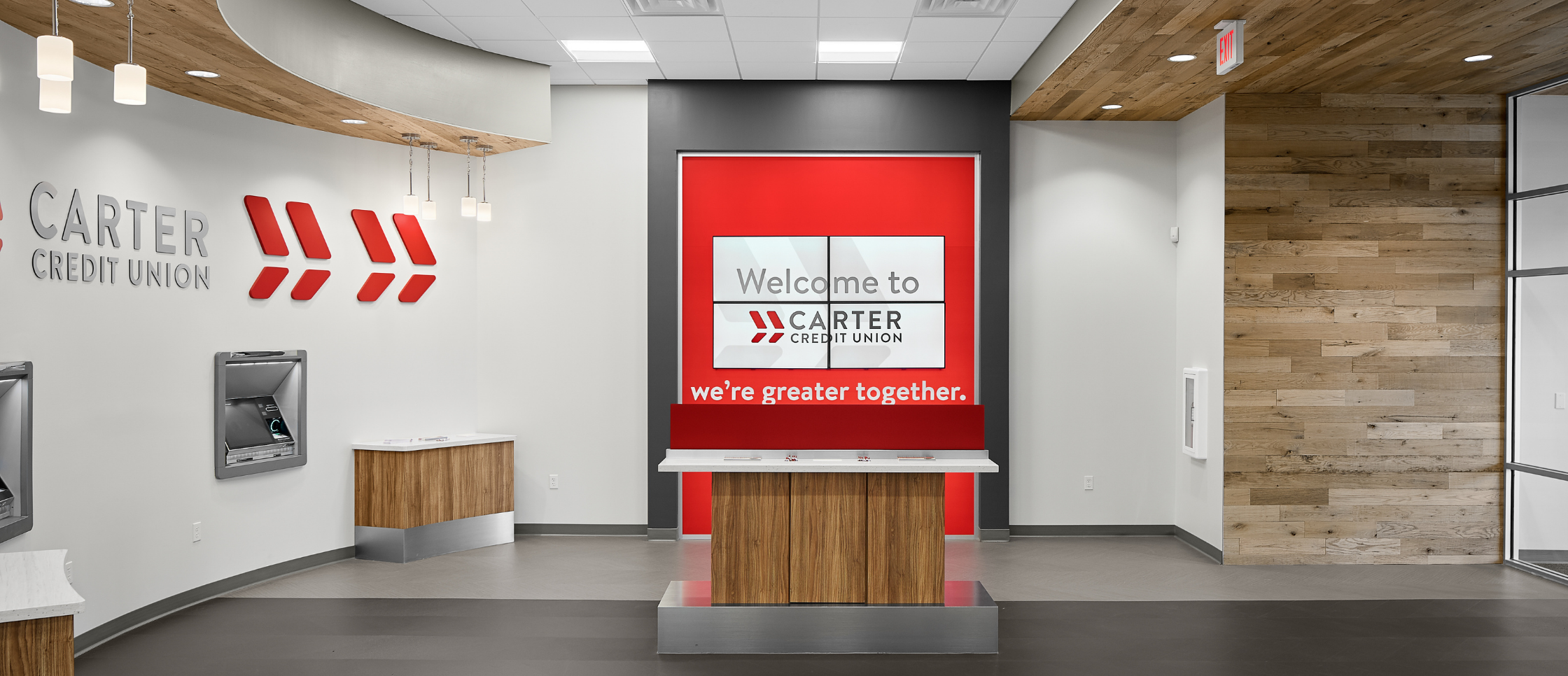
More than “stamping” the new brand on buildings and assets, the goal was to fully integrate Carter’s new brand into every step of the user journey. From a new tagline: “We’re Greater Together,” and a signature “Carter Red” to a full interior and exterior build out with architectural design inspired by the crisp angles of the modernized logo inspired architectural design.
IMPLEMENTING THE BRAND.
The modernized Carter Credit Union was more than design - it was the impetus for a complete overhaul of the entire user experience. Where technology was not previously integrated into the consumer journey, the new Carter Credit Union sought to be both high-touch and high-tech in how it lived its new tagline and brought the community together. From digital, like Interactive Teller Machines and tablets, to in-person gathering to enjoy a cup of coffee from the beverage counter, the new space not only invited members in, it invited them to stay.
.png?width=1024&name=Carter%20CU%20Before%20%26%20Afters%20for%20case%20study%20blog%20(2).png) New technology including ITMs and tablets coupled with traditional service methods invite members to choose their own member experience.
New technology including ITMs and tablets coupled with traditional service methods invite members to choose their own member experience.
A UNIFIED TEAM.
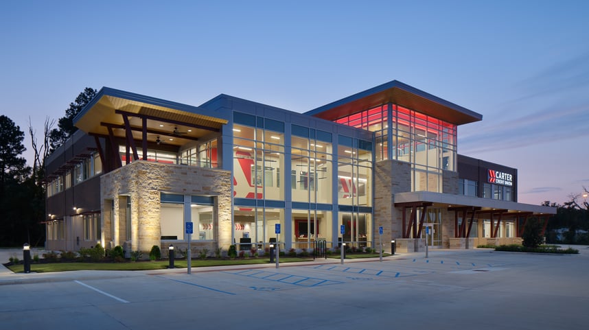
The results have been remarkable. Not only has Carter Credit Union made a name for itself in Bossier City, the rebranding effort is rolling out across its entire footprint. It also became a launching point for a new state-of-the-art 27,000-square-foot administration center designed to not only meet the needs of Carter’s current and future workforce but to serve as a key differentiator in attracting and retaining top talent.
The administrative building seamlessly merges traditional and contemporary styles into a flexible and invigorating space. From the outside, you cannot miss the bold exterior, as the administrative center now serves as a key landmark in and around the community. On the inside, strategic daylighting promotes wellness and also serves the bottom line through energy efficiency. Brand integration was a top priority throughout the space, inspiring members and employees alike.
 Prior to construction, Carter's administrative staff were spread out across three separate facilities, making collaboration difficult.
Carter Credit Union's challenge is a familiar one, but there's no one-size fits all approach to reinvigorating a brand" said Tom Kennedy, President of La Macchia Group. "A firm like ours that goes beyond design-build has the opportunity to spark new ideas and innovation for our clients. The results Carter Credit Union has seen came from a transparent and well-rounded partnership, and a commitment to their long-term growth.
Carter Credit Union is truly a case study in creating an award-winning brand that serves as a catalyst for growth and La Macchia Group was proud to be a strategic partner every step of the way.
.png?width=248&height=73&name=Logo%20w%20Tag%20-%20Color@300x%20(1).png)

.jpg?width=394&name=7%20Tips%20For%20First%20Impressions-CTA-01%20(1).jpg)


