Creating a Resonating Brand
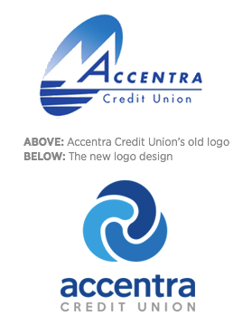
by La Macchia GroupAUSTIN, MINNESOTA - Creating a brand is never an easy process. Designing a logo that represents a financial facility and resonates with the members adds to the challenge. Accentra Credit Union, a Minnesota based credit union, reached out to La Macchia Group to help them establish a new, modern brand with two major goals in mind:
1. To create a new logo that will resonate with their current members and hold meaning
2. To offer a modern, attractive, and approachable look to target new markets
After La Macchia Group's thorough brand discovery phase, certain attributes were discovered that resonated strongest with Accentra's target audience. These attributes included a logo that represented TRUST, FRIENDSHIP, and PARTNERSHIP; could stand alone and hold meaning with the audience; and would embody a fresh, relevant, simple feel.
.png?width=248&height=73&name=Logo%20w%20Tag%20-%20Color@300x%20(1).png)


