
.png?width=248&height=73&name=Logo%20w%20Tag%20-%20Color@300x%20(1).png "Logo w Tag - Color@300x (1)")


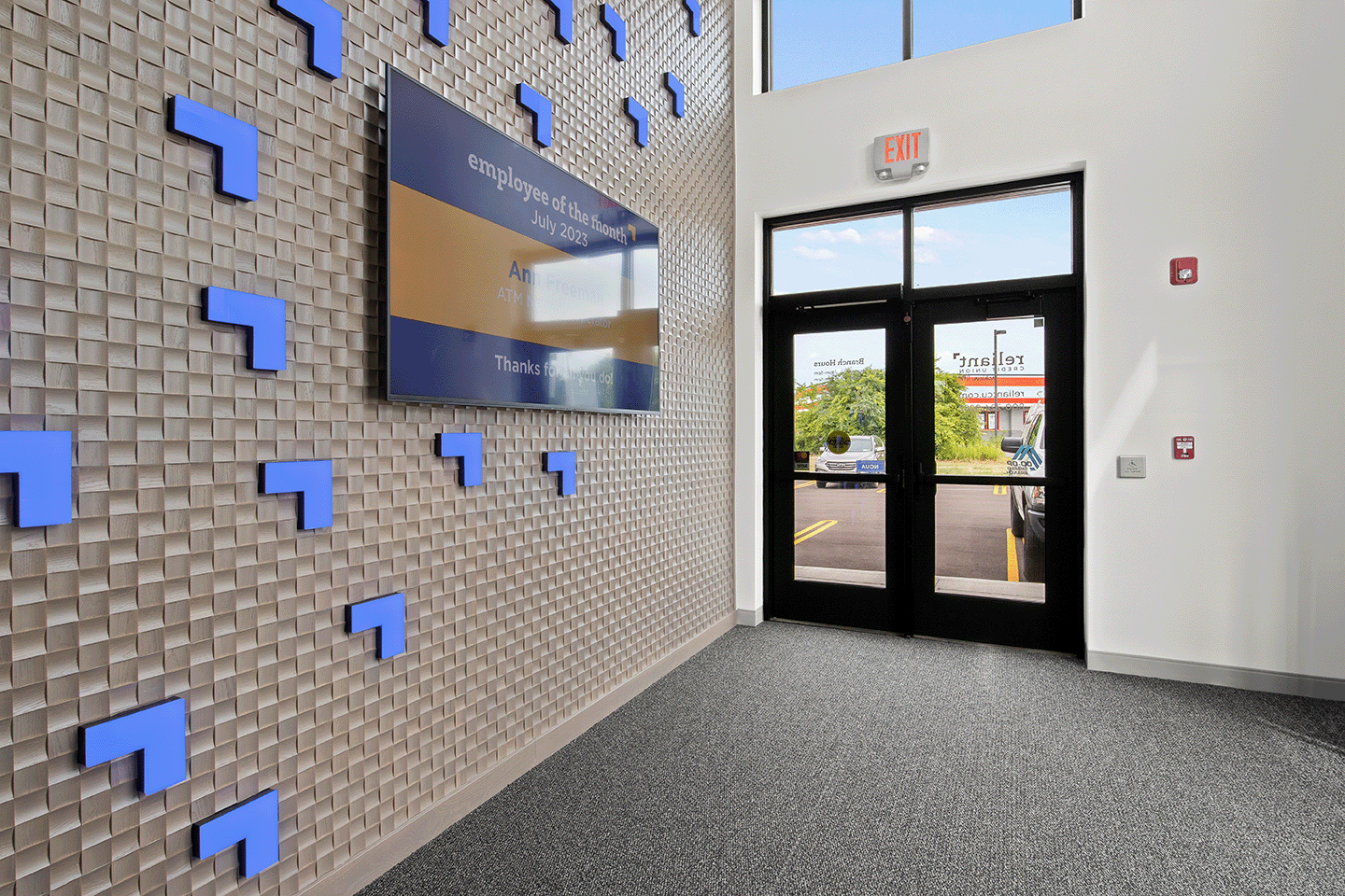
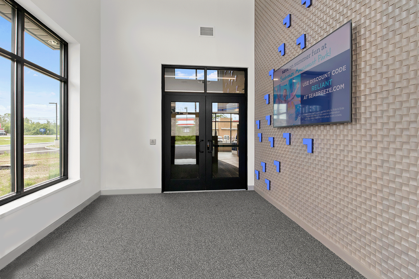
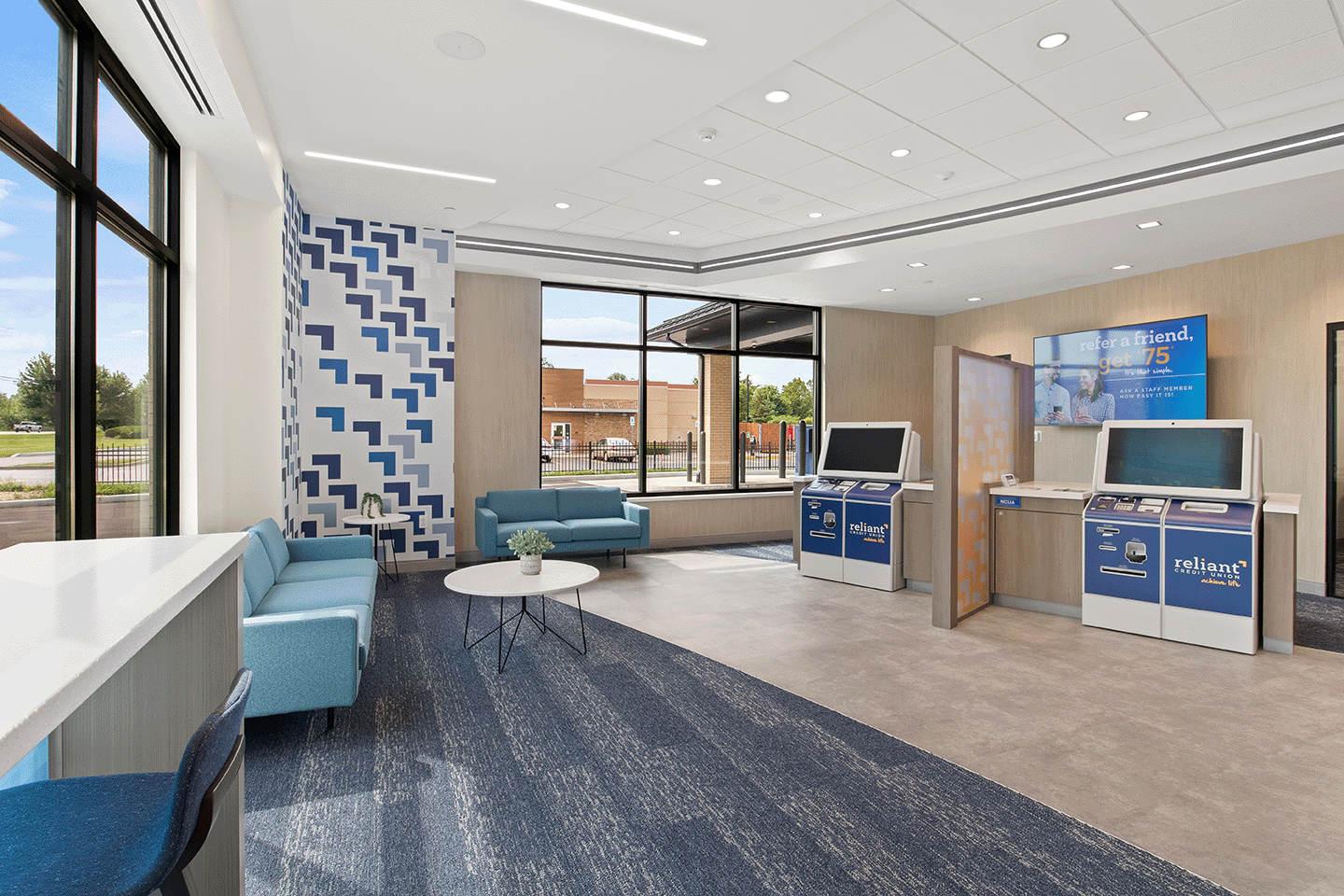
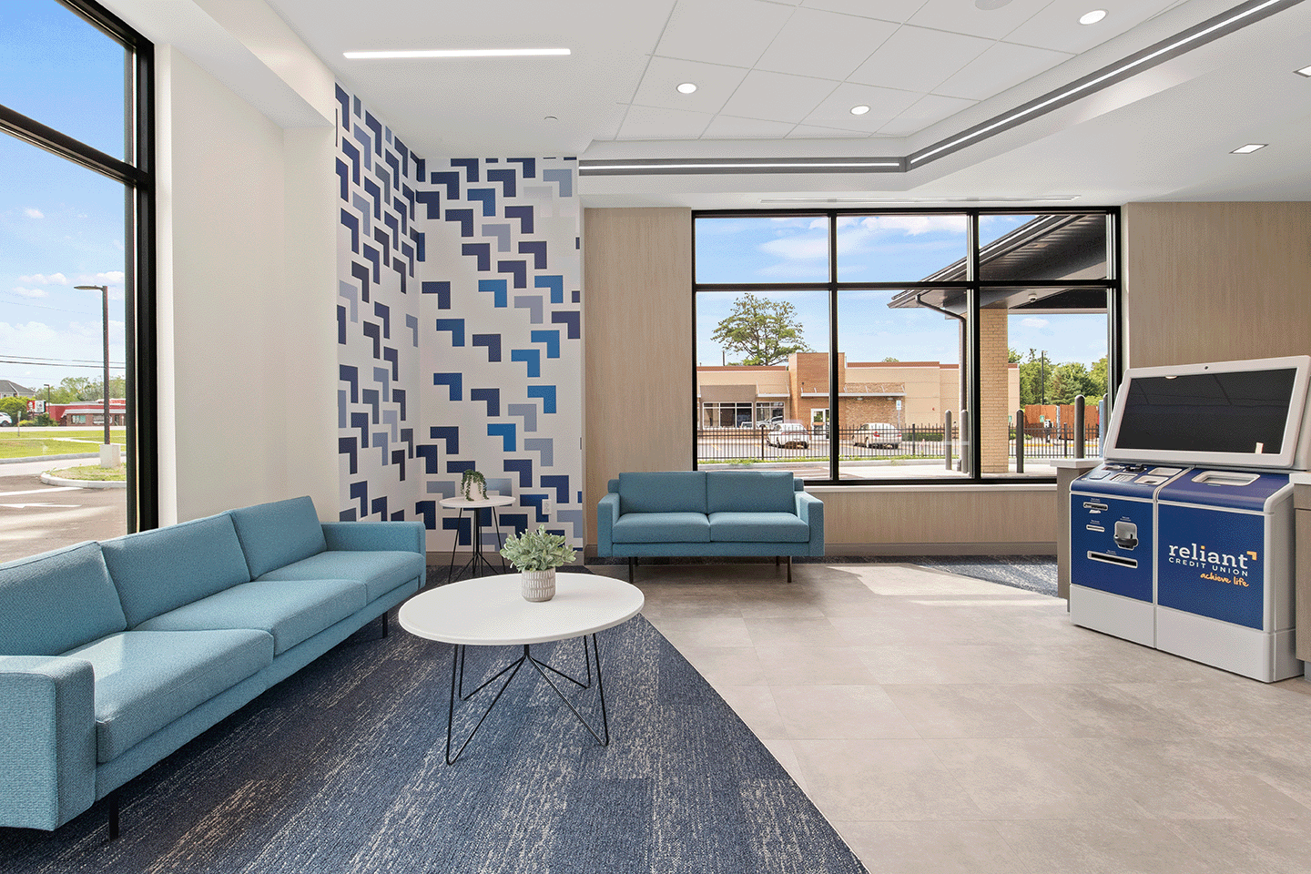
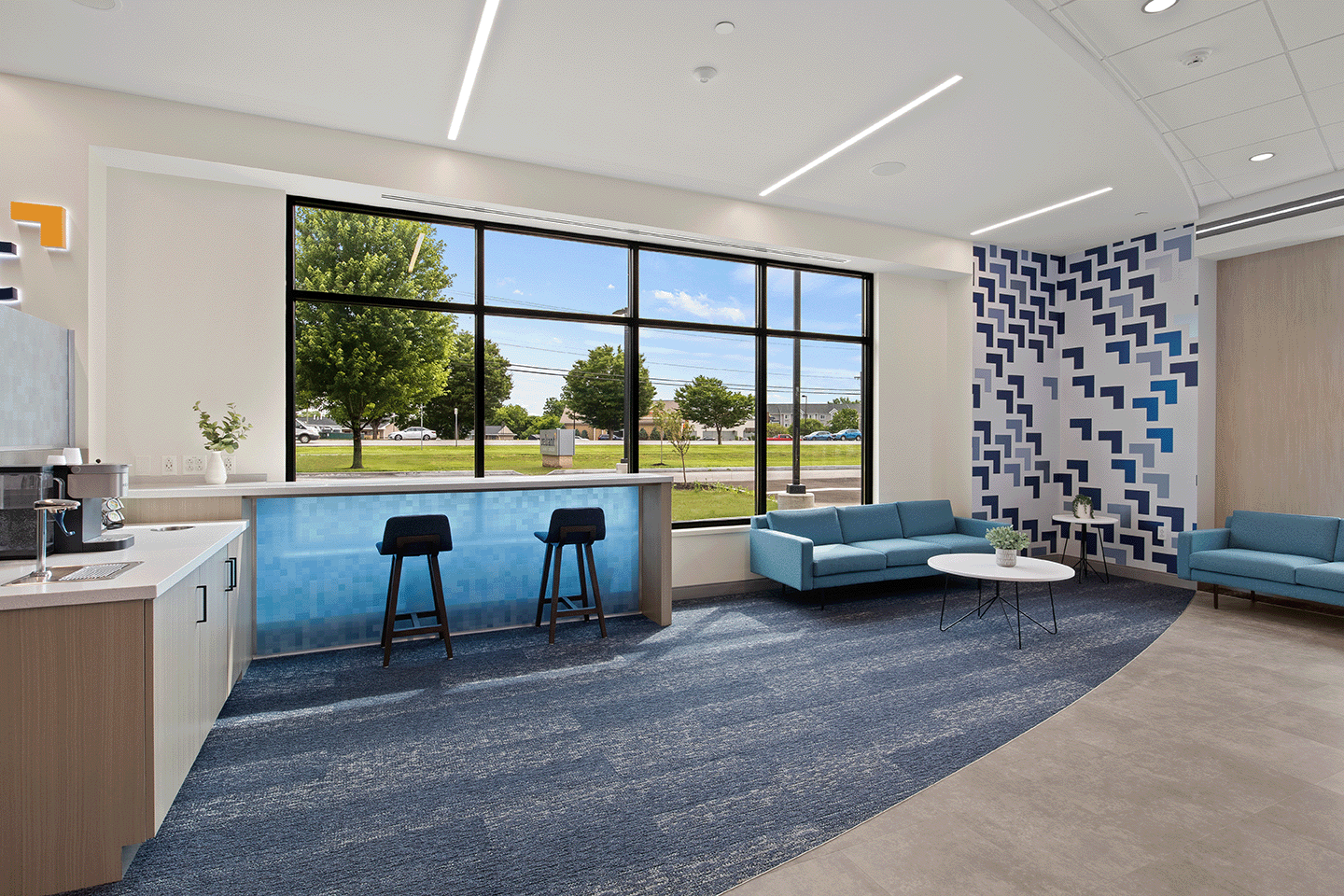
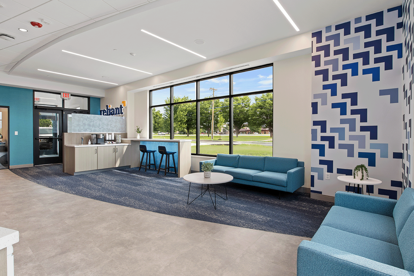
Diving into the brand refresh, Reliant brought these values to life through a new logo. Each element was specifically chosen to embody and enrich the new tagline. The lower-case slab-serif font was chosen for its friendly feel and the handwritten tagline was chosen to represent individuality. Reliant’s new logo design represented its dedication to keeping things simple, approachable and welcoming. One of the most prominent design features of this logo is the chevron arrow, which can be seen through graphic elements throughout the branch, and the LED lighting features in the branch vestibule (seen below). This chevron arrow represents a nod to always moving forward and achieving more in life.
.png?width=1500&height=200&name=Reliant%20(1).png)
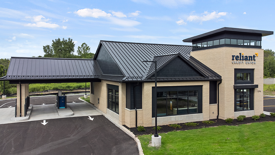
NEW BRANCH
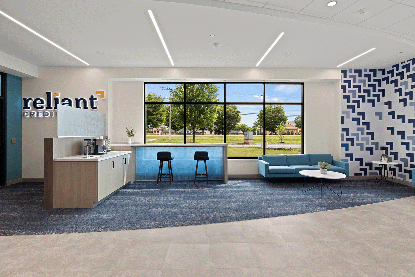
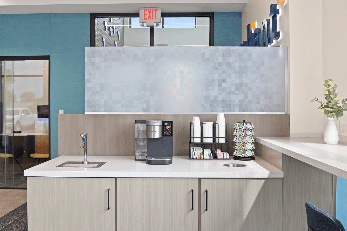
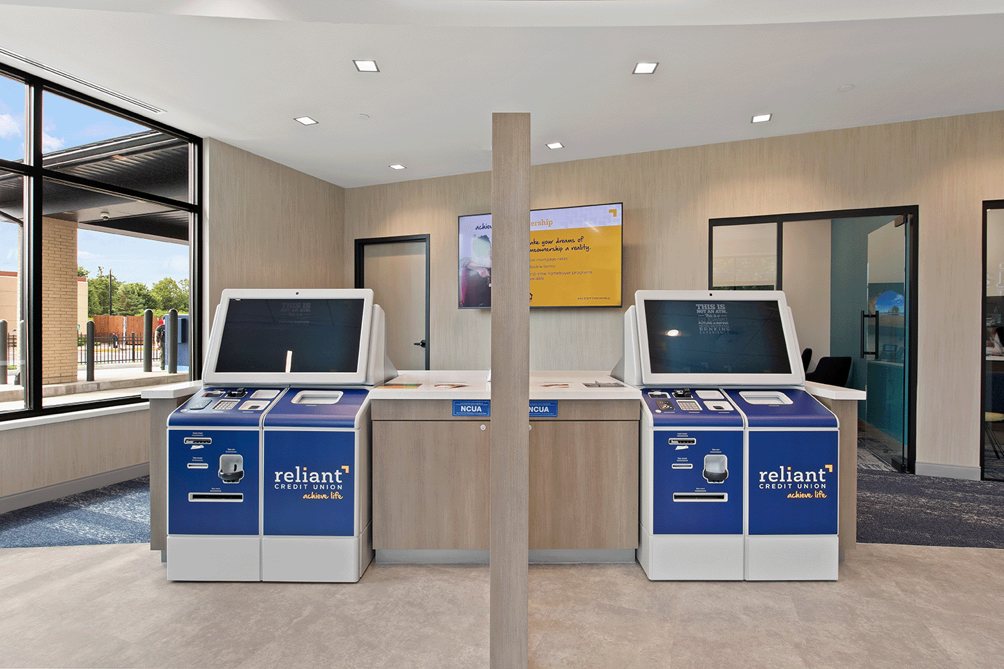
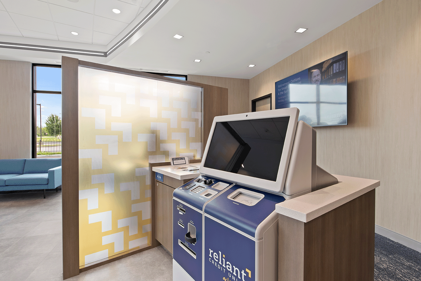
The brand new branch, situated on a busy corridor in Farmington, New York, was built as a destination for Reliant's members to conveniently transact with the credit union or to seek financial advice with one of their on-site experts. This location does not include a standard teller line. Instead, a welcome desk and greeter stand at the entrance, guiding members to transact at one of the two ITMs (Interactive Teller Machines) or with an expert within their offices. Adjacent to the greeter, a welcoming lounge area provides seating and a coffee bar for members to enjoy while visiting.
Vivalociti, La Macchia Group's technology division, installed digital displays throughout the branch that offer a dynamic way for Reliant to showcase promotional messages. See how the entire project turned out below!