
.png?width=248&height=73&name=Logo%20w%20Tag%20-%20Color@300x%20(1).png "Logo w Tag - Color@300x (1)")
by La Macchia Group
Branch design is one of the most important decisions when it comes to building a new branch, or renovating an existing one. Understanding the desires of staff and consumers is key when making these decisions. When designing a branch, it’s important to work with a partner who understands your consumers and what they are looking for from their financial institution. Take a look at four of our recent projects as we explore the details that make each branch uniquely tailored to its community and brand.
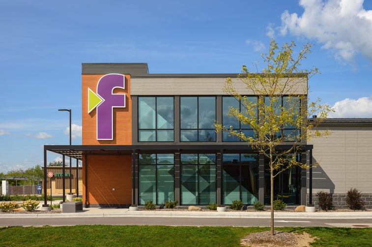
Forte bank- west bend, wisconsin
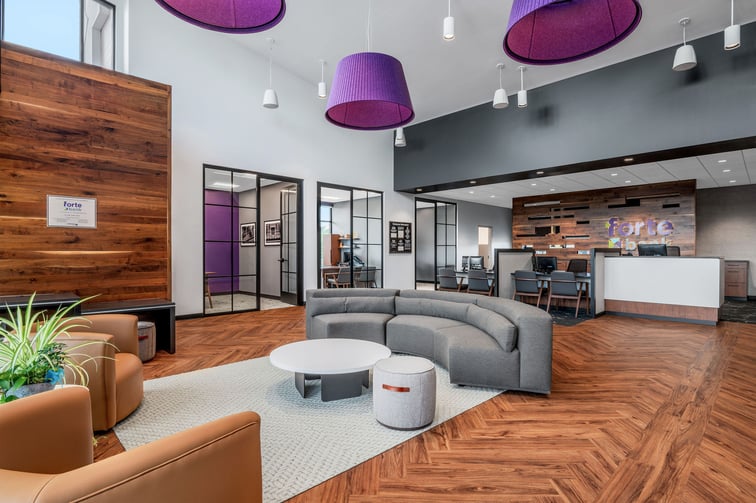
Forte Bank’s branch in West Bend, Wisconsin has quickly become a show stopper for customers and passersby alike. The exterior features a sleek, modern design complemented by warm wood tones, bold black metal accents, and contemporary gray siding. Clean lines and sharp angles give the building a strong architectural presence, while Forte’s logo in vibrant purple and green adds a striking pop of color and reinforces Forte Bank’s brand identity.
The interior is a reflection of both their brand, and the community they serve. The lobby walls feature a vinyl wall decal with local landmarks while accent walls feature the Forte purple and dark greys. The open floorplan and ample natural light makes the space feel light and airy as customers comfortably wait for appointments. A large 4 panel digital display allows staff to showcase promotional content, real-time rates, or community events and keeps visitors engaged with their surroundings.
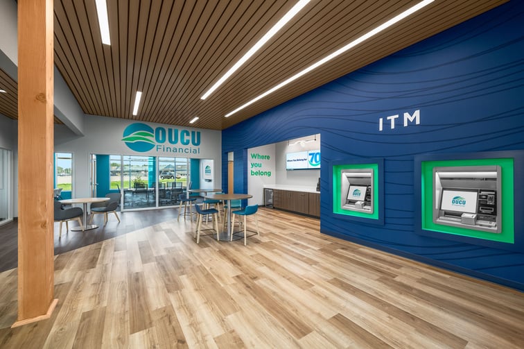
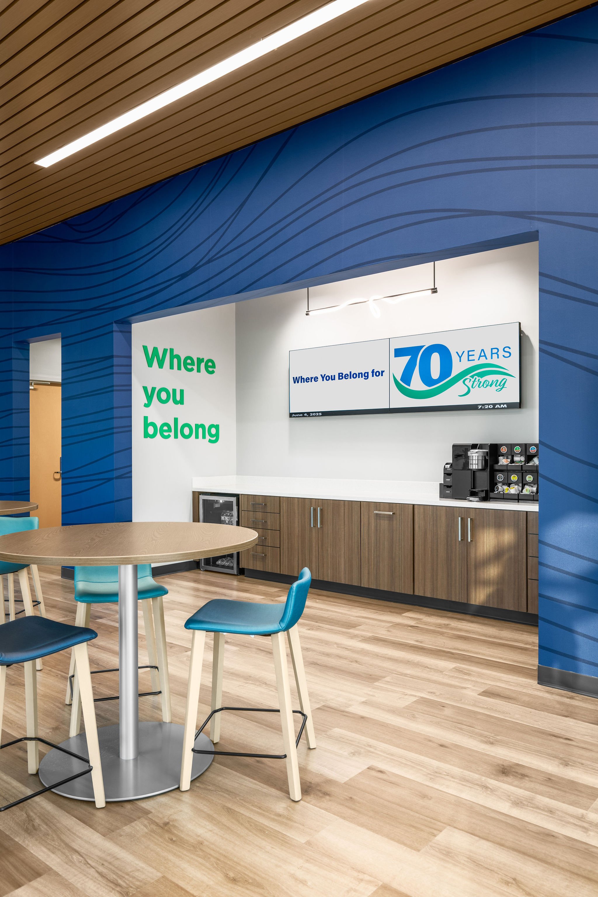
oucu financial credit union- lancaster, ohio
OUCU Financial Credit Union’s new branch in Lancaster, Ohio is the first branch opened outside of the greater Athens, Ohio area– so the teams knew this branch had to make its mark on the community. Not only is the branch located in a high-traffic spot near a grocery store, the bright brand colors against the neutral stone and siding draw attention to the space.
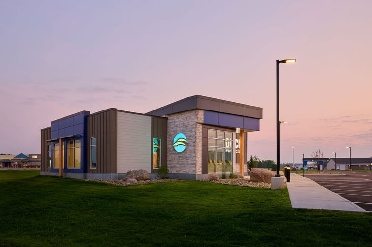
With two ITMs located near the entrance, seating areas throughout the lobby, and offices on the perimeter of the branch, this footprint is the definition of convenience for members. Glass doors and windows for the offices and conference room make the space feel open and bright, but also supports security measures knowing this branch doesn’t have a dedicated teller desk. The natural wood, bright yet calming blues, and branded signage all create a trusting atmosphere, reminding members that this is “Where you belong”.
buckeye state bank- columbus, ohio
Buckeye State Bank’s renovated Columbus, Ohio branch was designed to continue BSB’s mission to be a cornerstone of the community. The lobby features digitally designed vinyl wall coverings that display some important aspects of Buckeye State Bank and their community. You'll not only see the state flag of Ohio, but elements like leaves, flowers, and even the seeds of Ohio's state tree, the Ohio Buckeye. Their bold red pairs well with the stone and natural wood accents throughout the space. Incorporating a large LED corner screen and a captivating history wall into the lobby space was important for the BSB team, to better help blend the bank’s mission, customer focus, and branding into every aspect of the experience.
-2.jpg?width=718&height=478&name=BuckeyeBank-1885NorthwestBlvd-01%20(1)-2.jpg)
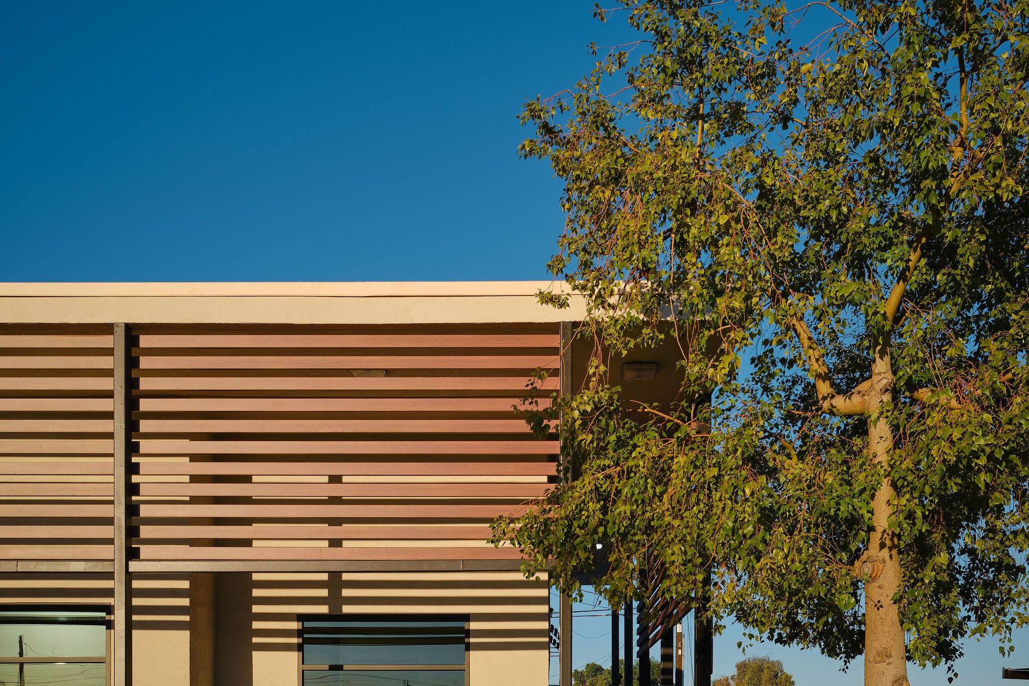
sun community federal credit union - imperial, california
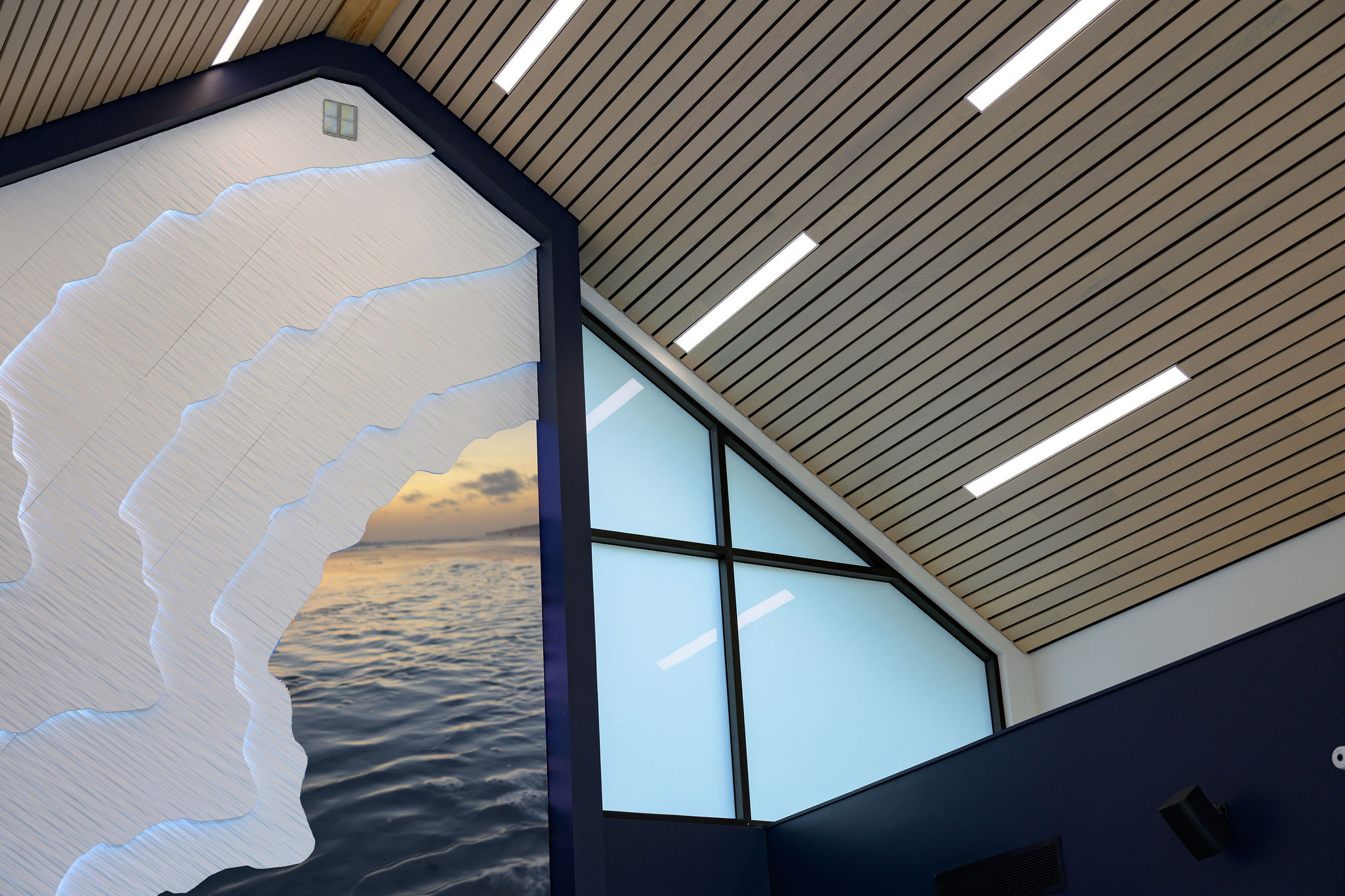
Sun Community Federal Credit Union’s Imperial, California branch was reimagined into an urban-coastal oasis, capturing the essence of the vibrant communities Sun Community FCU serves. Stepping inside, members are welcomed into a bright, open-concept space where modern design meets local heritage. Sleek, contemporary furniture and bold brand colors create a dynamic yet inviting atmosphere, while cutting-edge digital displays ensure a seamless banking experience.
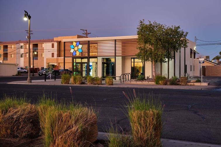
In the more private one-on-one spaces, history comes to life. With the help of the town’s historical society, carefully curated archival images line the walls, offering members an inspiring look into the rich legacy of their community. These powerful visuals serve as a reminder of the institution’s deep local roots and commitment to its members. The branch’s open layout prioritizes ease of movement, natural light, and accessibility, fostering a sense of connection and engagement. The teller area stands out with its striking blue-tiled counter, an artistic nod to Imperial’s endless skies and beloved neighborhood pools. Glass partitions enhance transparency, embodying the credit union’s core values of trust and openness.

Each of these projects showcases how thoughtful branch design goes beyond aesthetics, it creates meaningful experiences that strengthen relationships between financial institutions and their communities. From vibrant brand integration to locally inspired details and cutting-edge technology, every element plays a role in telling a story of trust, connection, and innovation. By combining strategic design with a deep understanding of consumer and staff needs, these branches don’t just serve their communities, they reflect them.
.png)