
.png?width=248&height=73&name=Logo%20w%20Tag%20-%20Color@300x%20(1).png "Logo w Tag - Color@300x (1)")

by La Macchia Group
In 2019, Reliant Credit Union embarked on a journey to revamp its brand identity, a decision influenced by a desire to maintain a modern approach to banking while upholding their welcoming atmosphere. They turned to La Macchia Group for guidance. What emerged was not just a refreshed brand, but a symbolic representation of Reliant's dedication to simplicity, approachability, and progress.
Founded in 1970 as the Wayne County Teachers Association (WCTA) Federal Credit Union, the institution later evolved into Reliant Credit Union in 2007, signaling a broader membership base and values centered on trust and individual success. Fast forward to 2019, and it was time for a change!
The Brand Evolution
A key element of Reliant's rebrand was the creation of a new logo. The process began with thoughtful consideration of the credit union's history and aspirations. La Macchia Group used a phased approach, combining analytical research and creative intuition, to create a new brand identity.
The lowercase slab-serif font was chosen for its friendly and approachable feel, while the handwritten tagline - "Achieve Life" was developed in alignment with their brand promise, emphasizing the credit union's role in helping members achieve their individual life goals. This tagline isn't just a catchy phrase but a guiding principle in their services, enabling them to assist members in various life milestones, such as graduation or retirement.
Additionally, one of the most striking design features of the logo is the chevron arrow, a nod to always moving forward and achieving more in life. Not only does it represent forward movement and journey for members, but it shows that Reliant is a forward-thinking credit union.
![]()
Design-Build Excellence
The brand refresh wasn't limited to marketing materials; it was also beautifully incorporated into their latest branch in Farmington, New York, also designed and built by La Macchia Group. This location is truly a testament to their commitment to providing a modern banking experience while retaining the warmth and welcoming atmosphere that Reliant is known for.
As you step into the branch, you're immediately greeted by a LED light display of the chevron arrows going upwards, showing the concept of journey and progress. Custom wallpaper, designed with finishes that mirror the chevron watermark on member debit cards, adds an extra touch of uniqueness. Even the greeting station is thoughtfully designed, with a footprint shaped like a chevron, subtly reflecting the brand's essence.
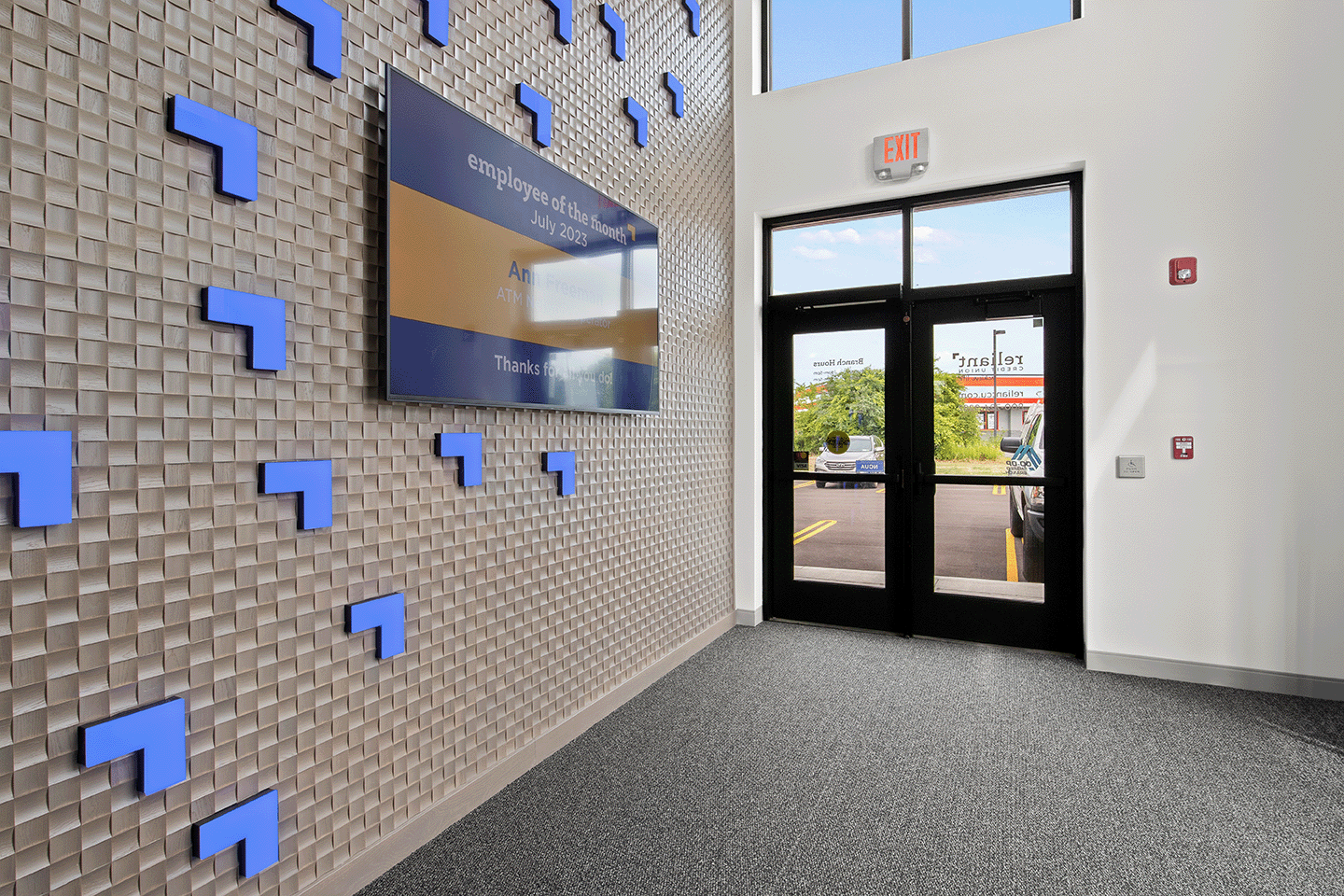
The new branch features two Interactive Teller Machines (ITMs) in the lounge area for quick transactions and video teller services. A coffee bar and ample seating provide members with a comfortable space to visit, relax, and chat with financial experts. Vivalociti, a specialized technology division at La Macchia Group, installed digital displays throughout the branch. This is a great way to promote products and services while continuing to display advanced technology at Reliant.
Cynthia Hamann, VP of Brand Experience at Reliant, stated, “La Macchia Group works extensively with credit unions and understands the unique strengths and opportunities of the credit union industry. We have found La Macchia Group to be attentive to our requirements and willing to adjust as needed throughout the process.”

Ultimately, Reliant Credit Union's rebranding journey isn't just a change in aesthetics; it's a reflection of their commitment to their members and the communities they serve. The new brand identity, symbolized by the chevron arrow, emphasizes progress and the unique paths each member takes in life. The new Farmington branch is a physical manifestation of this brand transformation as well. With La Macchia Group's guidance, they've achieved a successful brand evolution and built a new branch that reflects their history and vision for the future.
.png)