
.png?width=248&height=73&name=Logo%20w%20Tag%20-%20Color@300x%20(1).png "Logo w Tag - Color@300x (1)")
TopLine Financial Credit Union was chartered in 1935 when seven employees of the Bell System pooled $35 to create Minneapolis Telco Credit Union. Early members were employees of Minnesota's Bell System telephone company, from telephone linemen to operators. When the Bell System broke up in the 1980's, they expanded their membership to include additional employee groups. By the '90's, they converted from a state to a federal charter to expand their membership. Fast forward to today, TopLine Financial Credit Union has converted back to a state charter, and has seen successful growth serving the entire Twin Cities area with five branch locations.
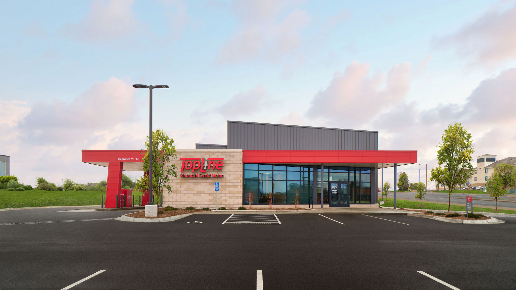
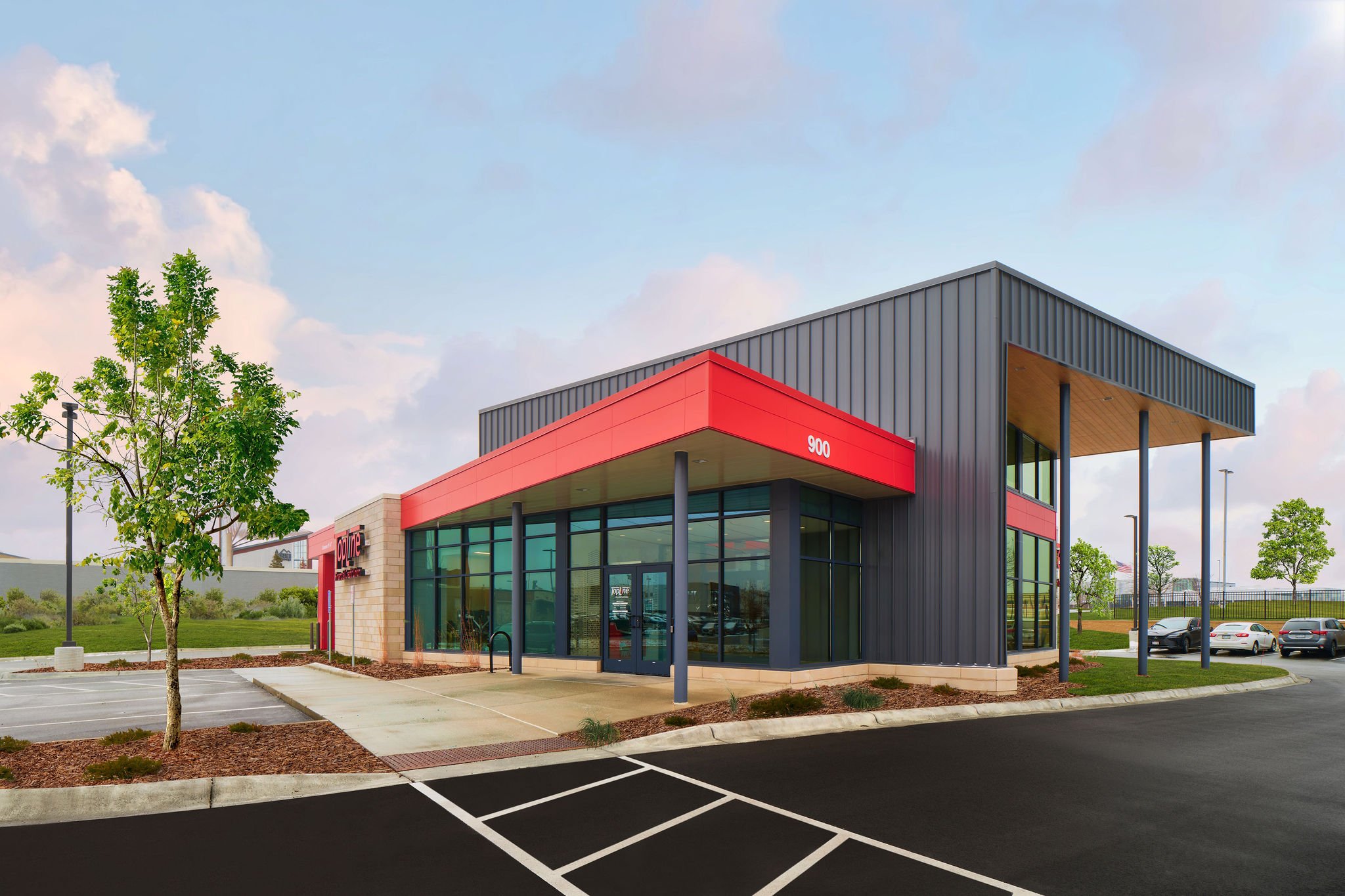
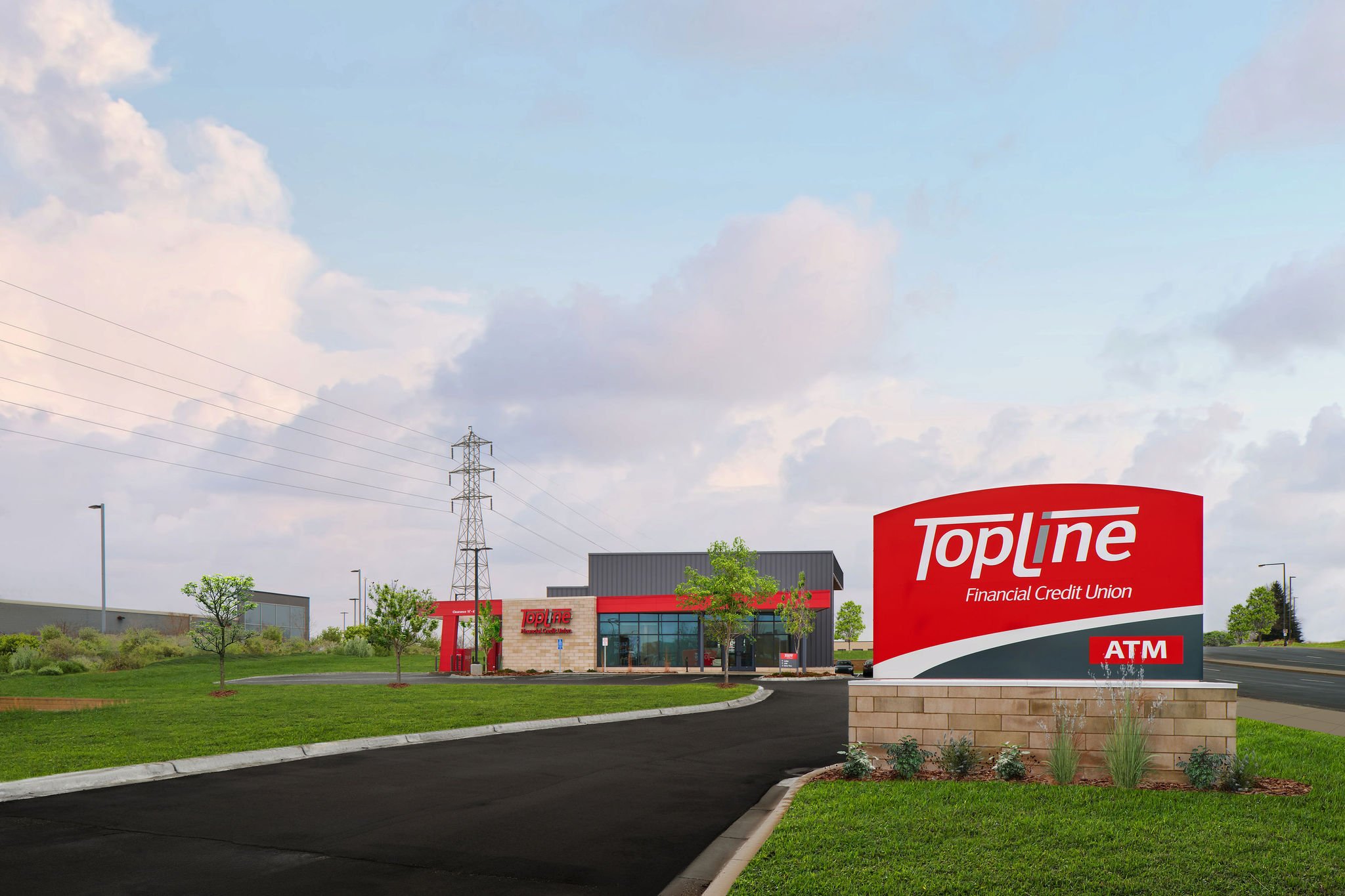
Based on the recommendations from La Macchia Group’s strategic analysis, TopLine Financial Credit Union's Bloomington branch was relocated from a underused side street to American Boulevard, a heavily traveled street near the Mall of America. Their desire to attract more members would certainly take hold with the thousands of cars driving by daily, and the demographic data supported this.
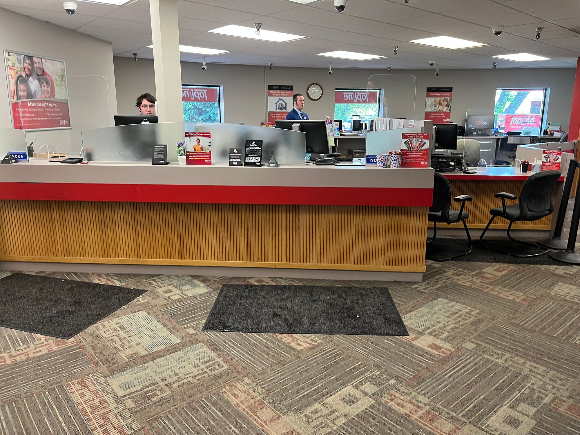
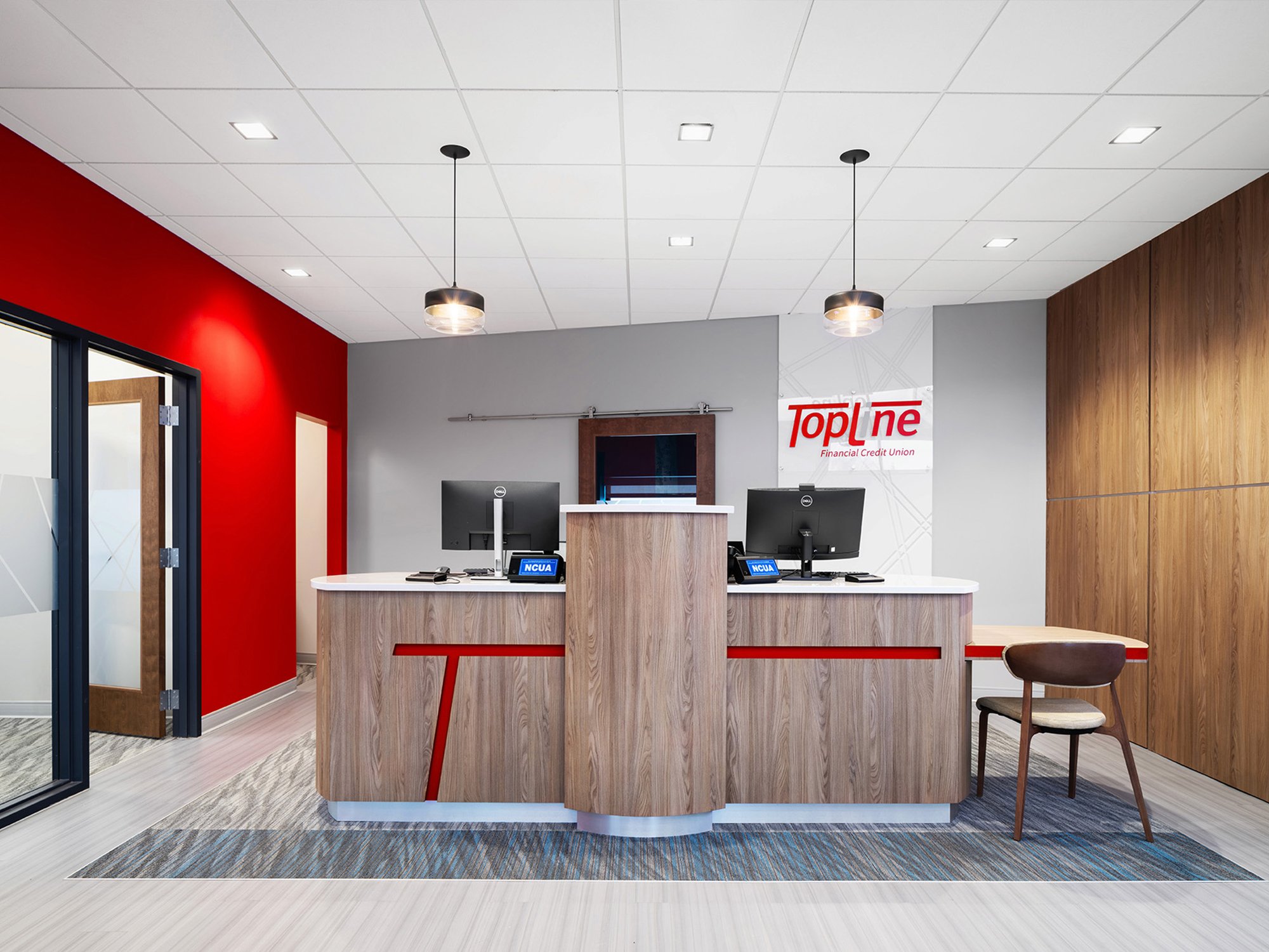
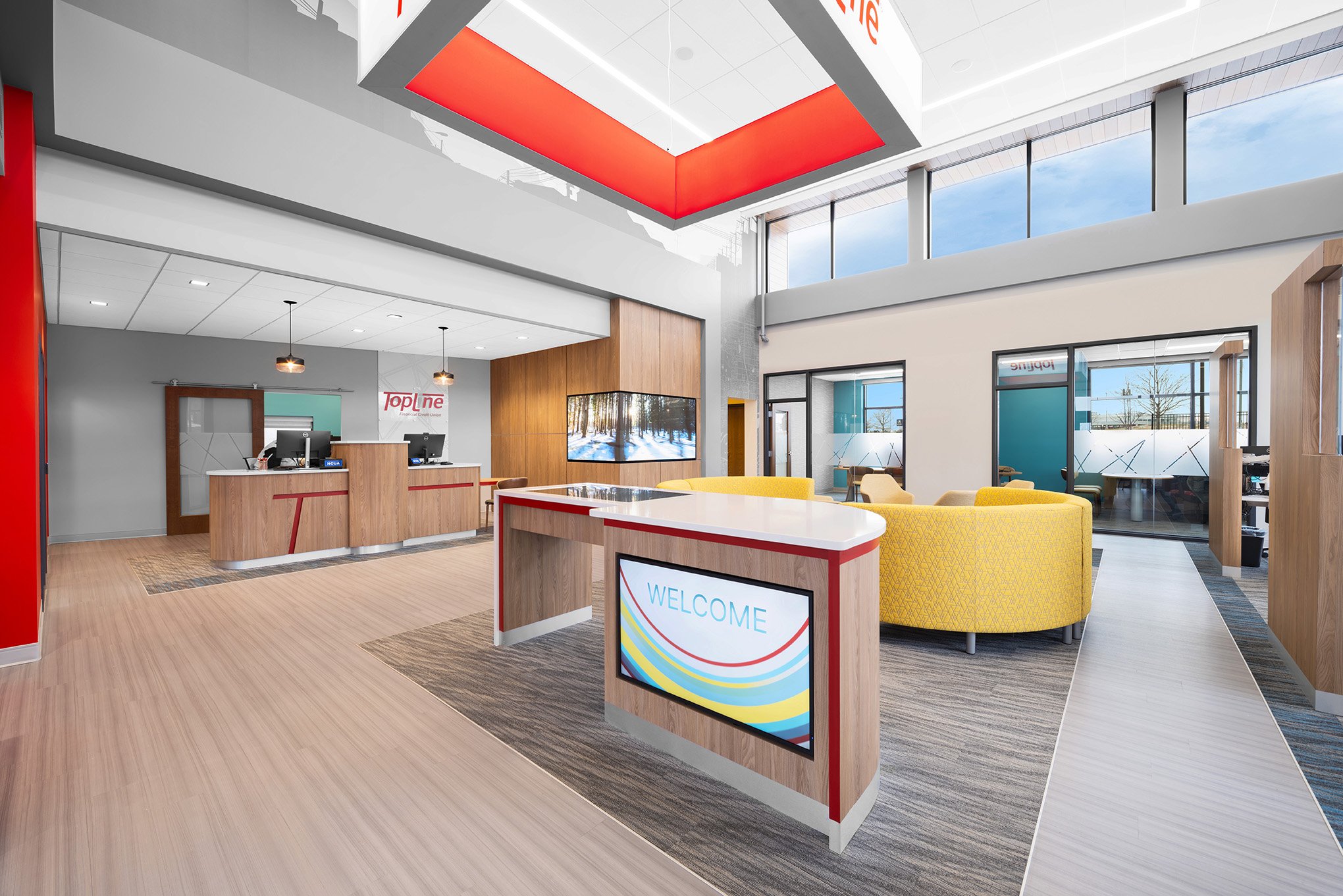
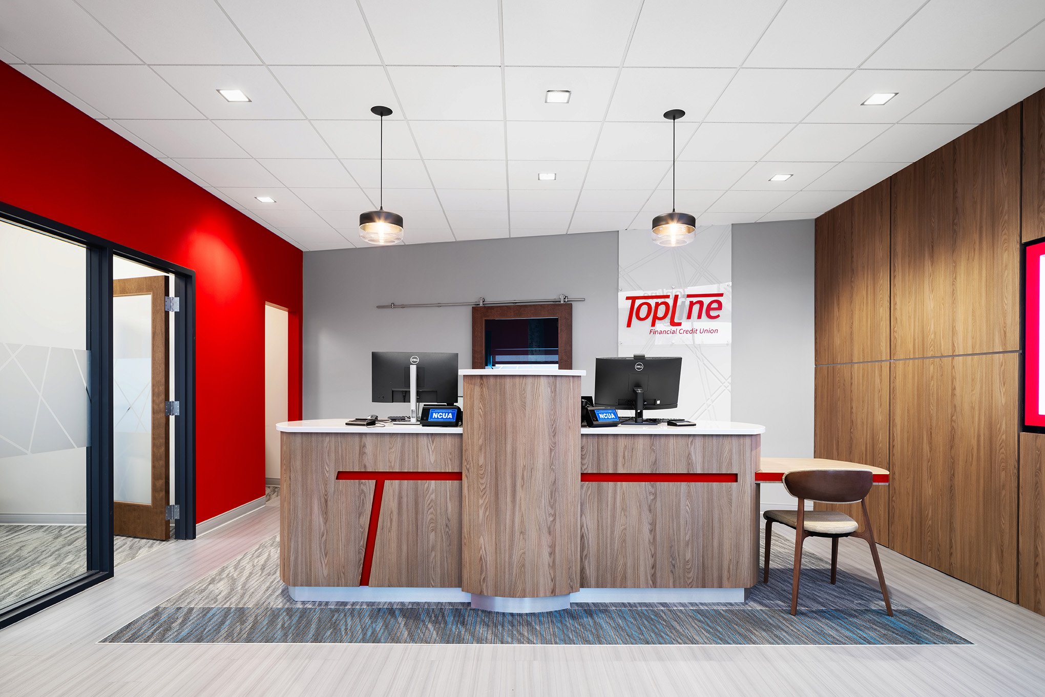
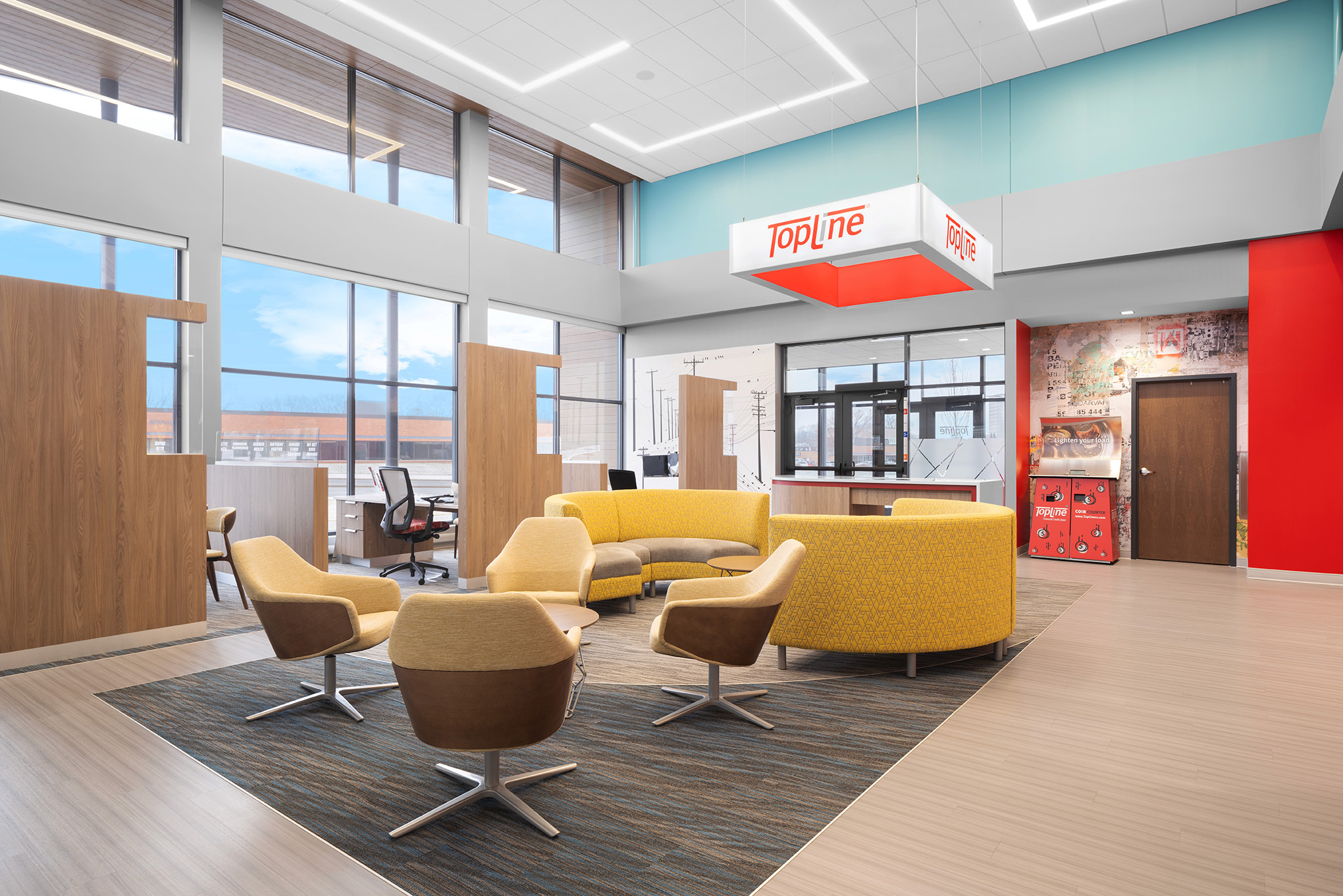
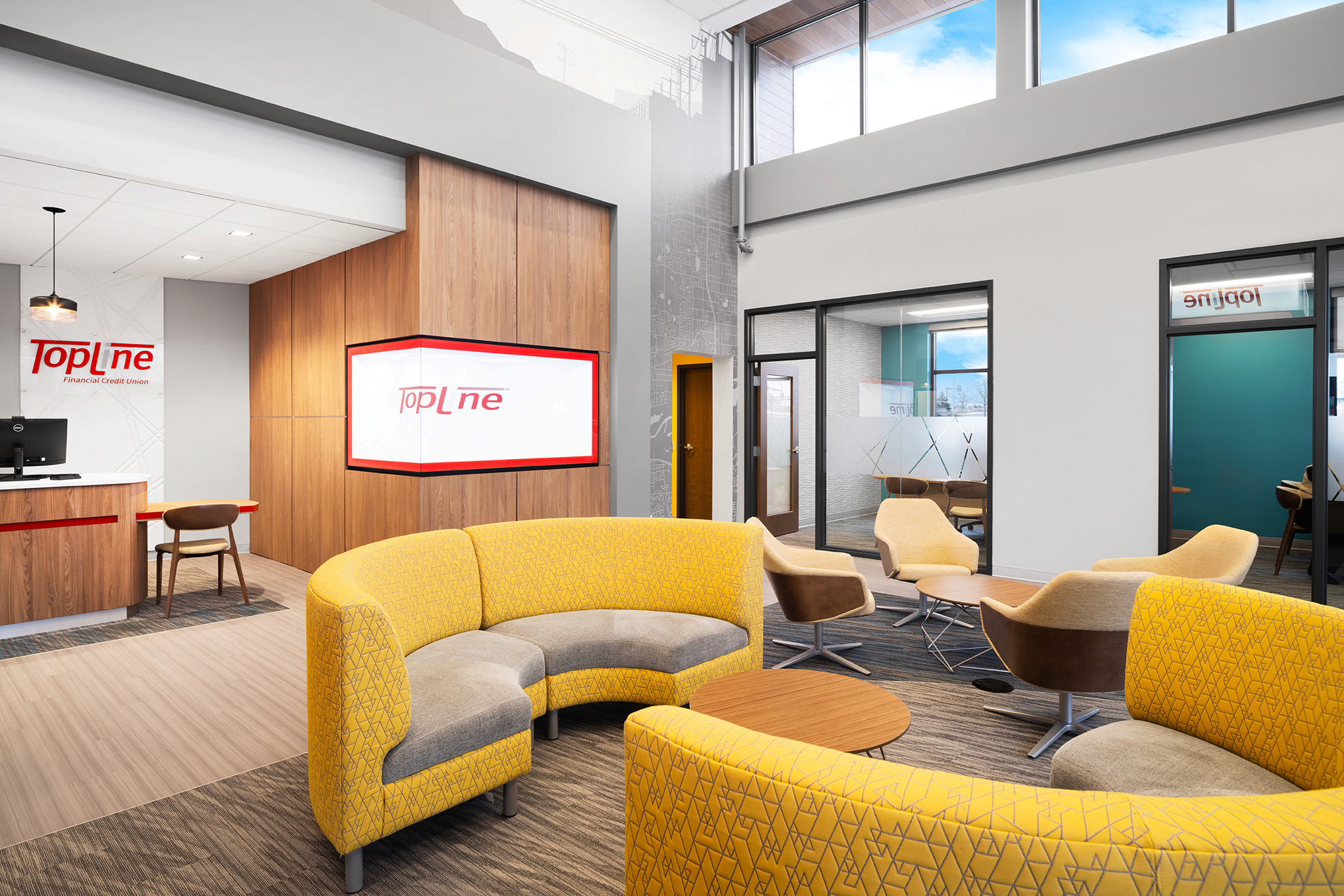
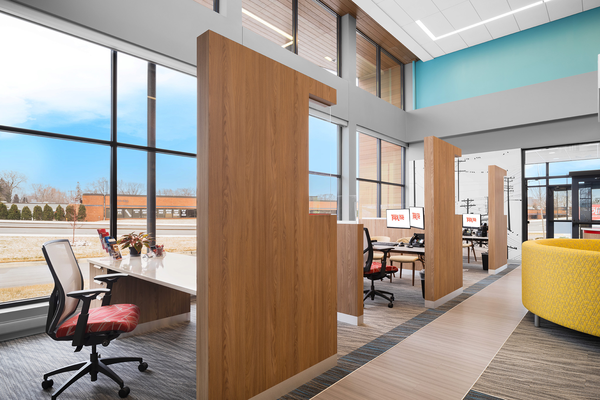
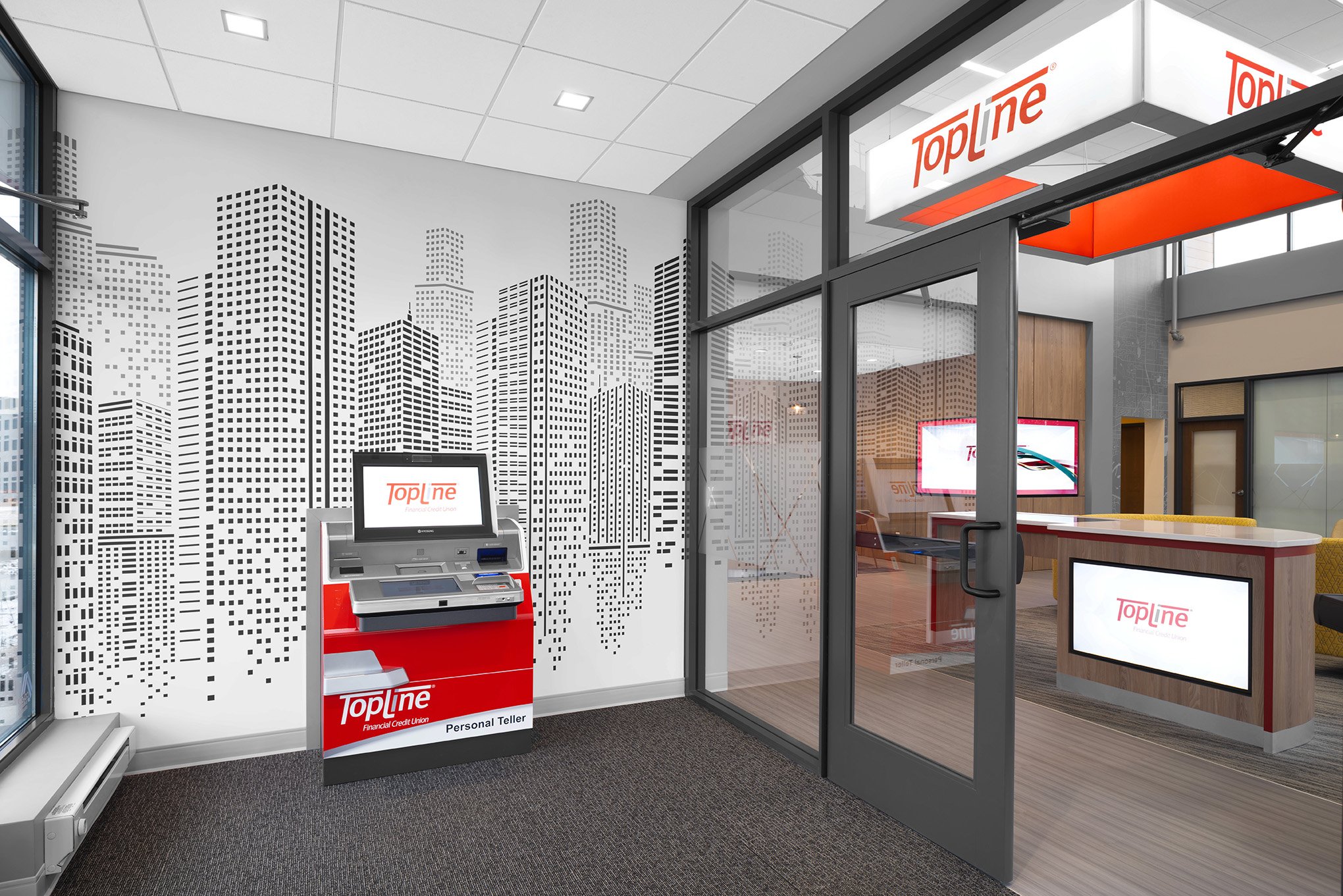
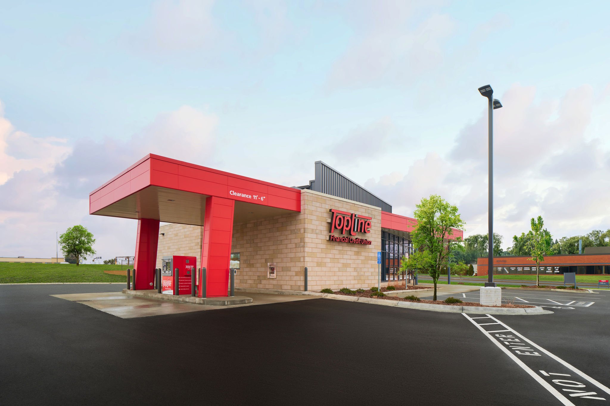
Welcoming new and existing members into a convenient, casual space was important, as well as embracing the history of the charter. Areas for members and employees to perform transactions include two teller pods and semi-private meeting spaces, as well as an interactive teller machines (ITM) within the vestibule and in the drive-thru lanes.
The facility's open concept design features floor to ceiling windows that create a bright and airy space within. Interior branding is visible from the exterior with murals, LED screens, and an illuminated brand element suspended from the high ceilings. The wall murals capture the history of TopLine's original members with abstract expressions of telephone lines, which is also echoed throughout the design of the building and logo with a heavy use of the capital "T". The largest representation of this can be found in the canopy over the drive-thru lanes.

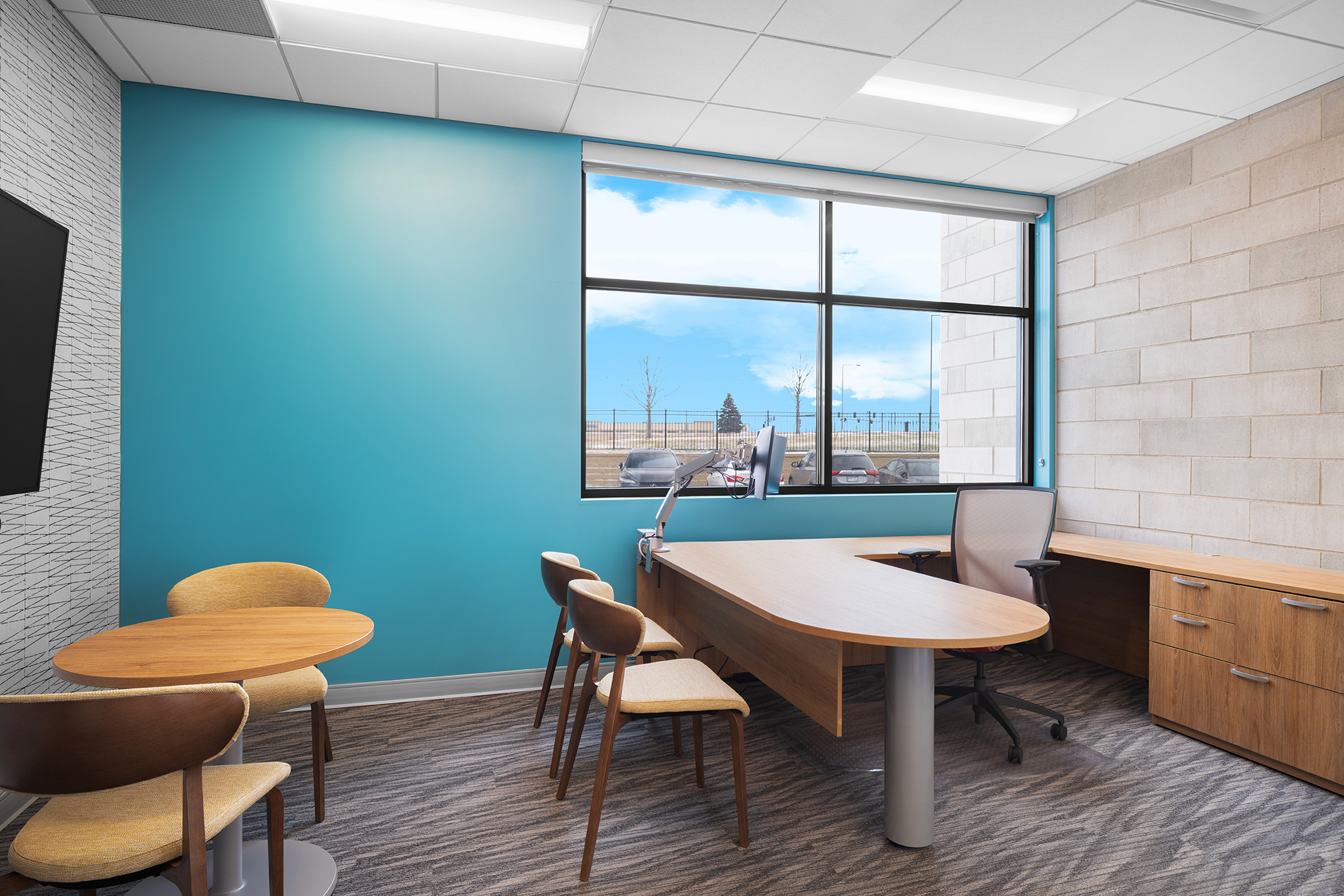
Bold use of their branded color red is complemented with cheerful yellow upholstered furniture, natural light wood tones, and pockets of turquoise blue within the offices. An unexpected tech element was added next to the teller line with the installation of a corner direct view LED screen. Wrapping 90° into a corner wall, the screen appears seamless from every angle that gives a 3D effect.
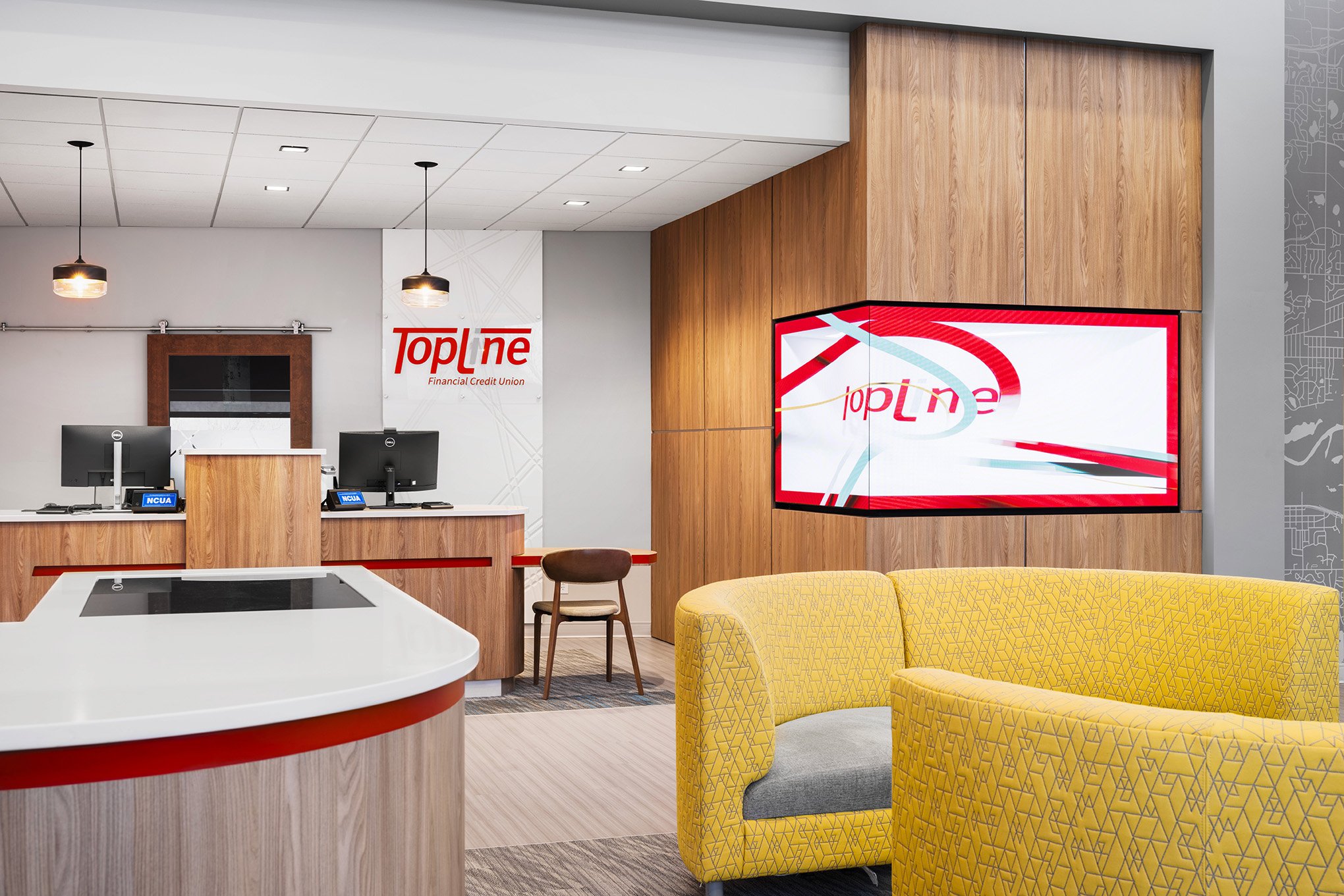
TopLine's corner direct view LED screen is perfectly placed in an area that draws members attention, and currently featuring branded animation (as seen below). The application is easy to use, allowing the credit union to change the video for seasonal and promotional initiatives.